Brand X: Stomü
Project Lenght: 4.5 WeeksWorking in teams of four, we were asked to develop the proposition for a new brand, whose focus will serve the needs of a clearly identified market in the near future. By responding to emerging and predicted social, cultural, technological, political and economic trends, our new brand will anticipate new concerns, desires and behaviours to reveal a business opportunity within a specific market sector.
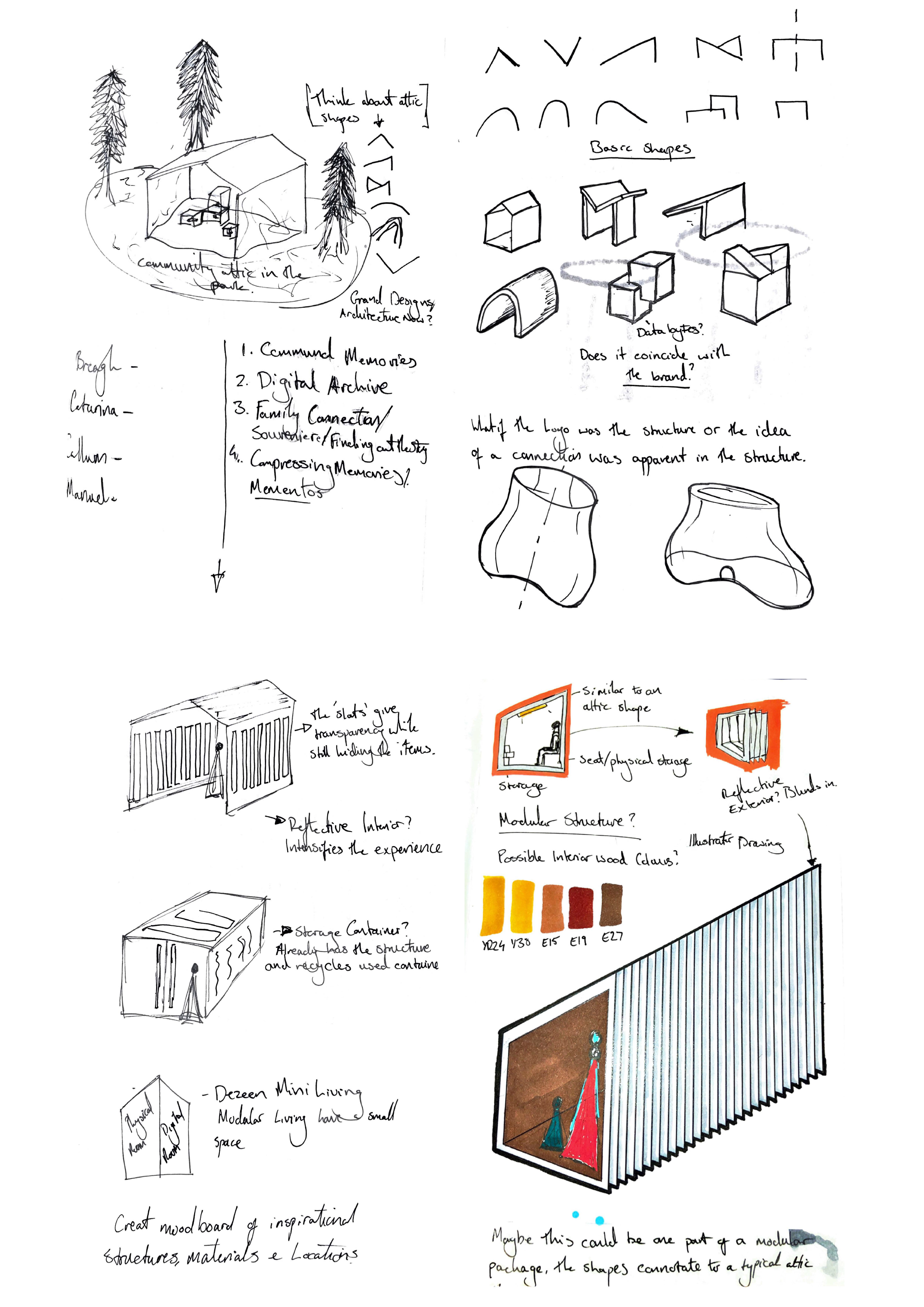
We were also designated a room in the home to tailor our outcome towards and so we were assigned the attic/store room/cellar.
From this we created Stomü, a brand that helps store our cherised memories and belongings in a world where space to store is a luxury and has made living become more and more insular.
Initial Thoughts
I began to try and understand what we use the three various storage rooms for. Below is my thought process.
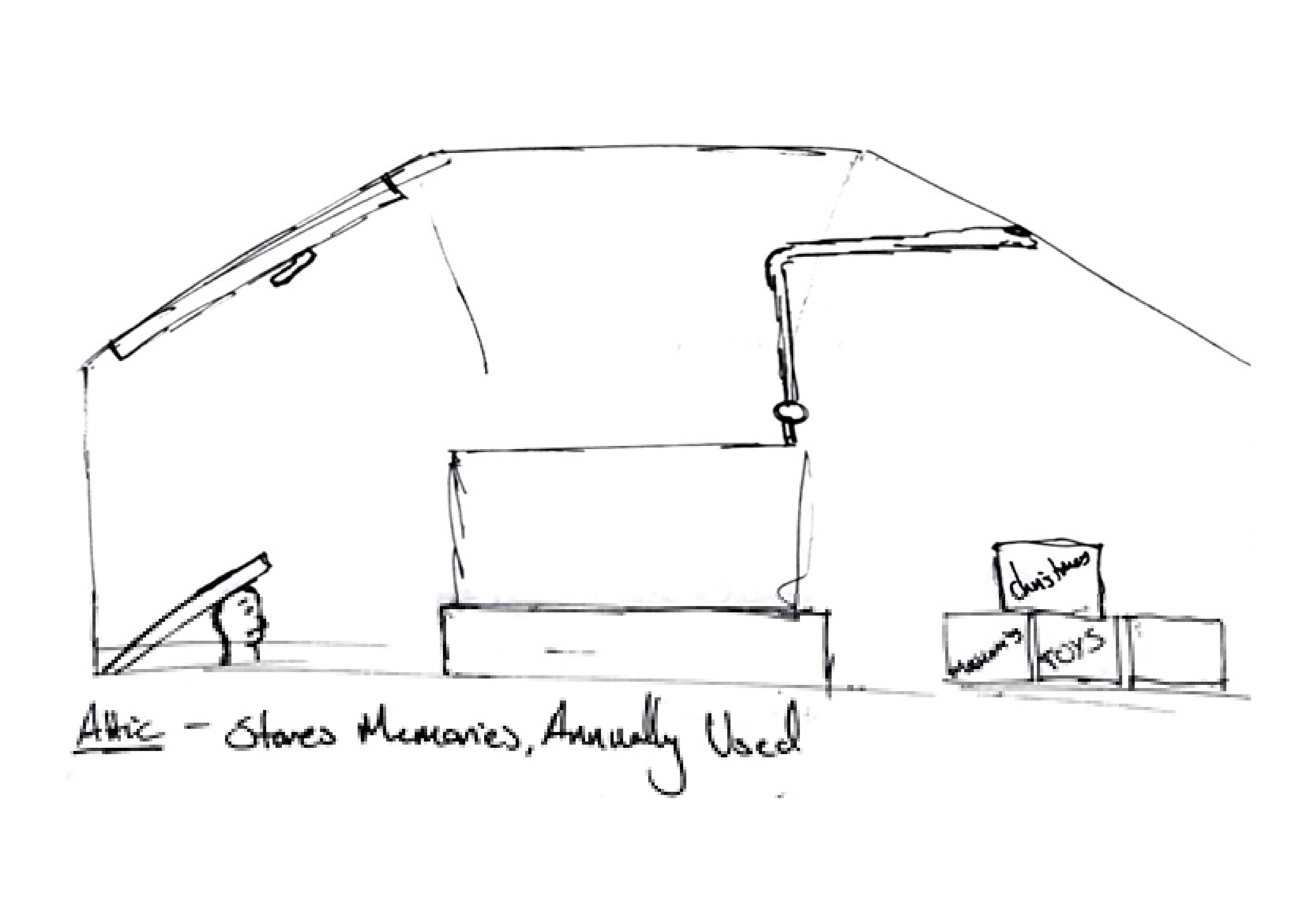
Attic
-A place where annual objects i.e. christmas decorations are stored.
-Objects of value in terms of monetary value or sentimental value like nostalgia or having a strong emotional connection.
-For me important childhood moments of my life are stored in the attic, my dads vinyl collection and art books, gran’s post stamp collection and granddads photos of his time in the war.
-Overall the attic stores the precious memories that you don’t really use but don’t want to throw away.
Cellar
-First thought that comes to mind is a wine cellar, for the affluent folk.
- Usually a damp, dark environment.
- In my experience I’ve never been in a cellar and I don’t know if they are that common.
- They are synonymous in horror movies as dangerous places where a character walks in and gets killed.

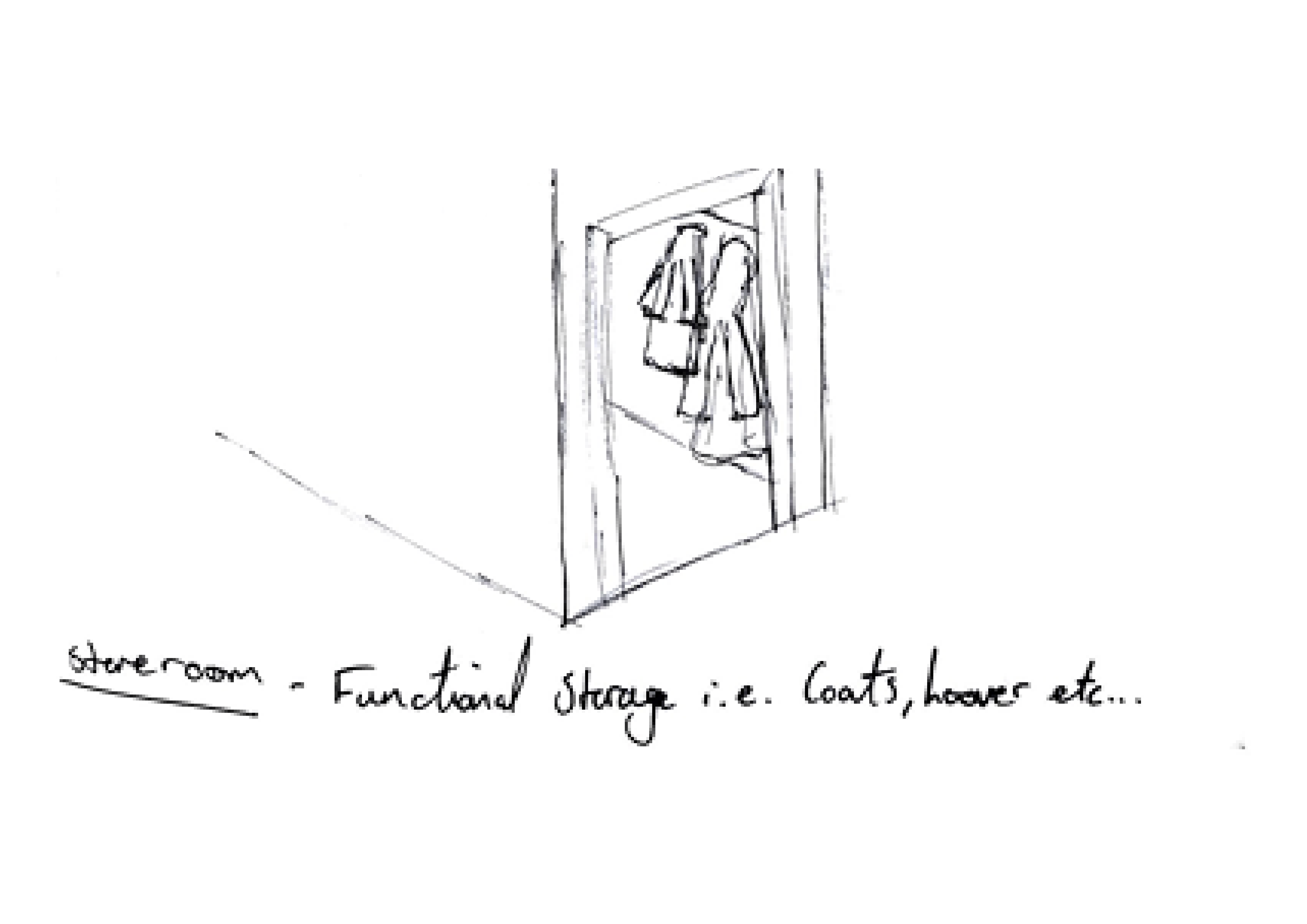
Storeroom
-Its the constant functioning room out of the three.
- Items usually stored are vacuums, coats and other items that are frequently used.
- In terms of size it is usually the smallest room, there isn’t a lot of space to work with.
- Nowadays there are furniture designers/ manufacturers that use storage in a compartmentalised way to reduce wasted space dedicated to ‘stuff’.
Trending...
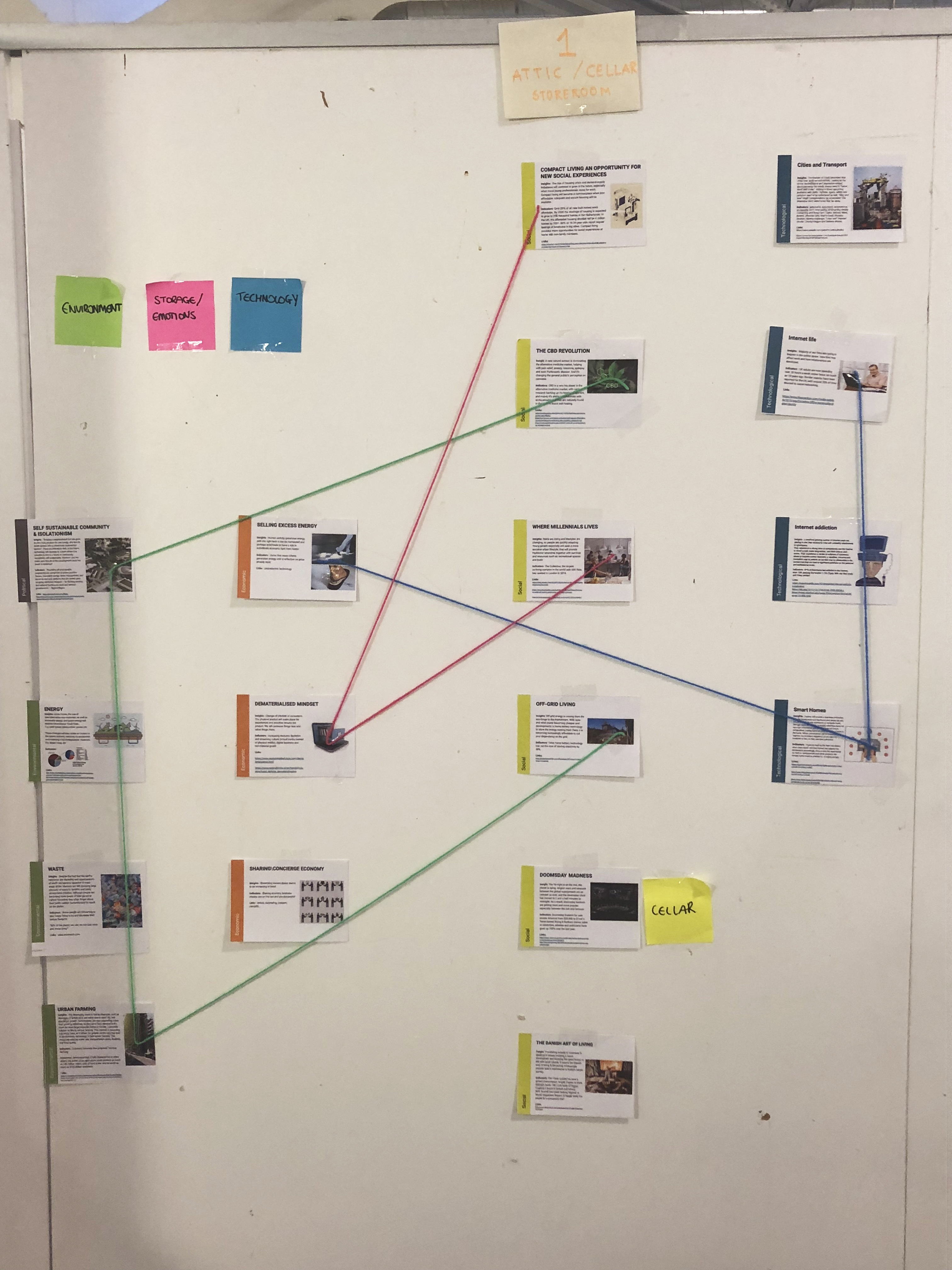
We began to research current and projected trends ten years into the future to fully understand the landscape we would be designing for.
As a year group we posted our ideas on a wall and would then research the areas of interest further.
As a year group we posted our ideas on a wall and would then research the areas of interest further.


Brand Opportunities

Opportunities --->
Storage Museum
A place in a community where people can display both their physical and digital artefacts in order to connect physically with their neighbours and to reduce any hate crimes involving race and religion.
A place in a community where people can display both their physical and digital artefacts in order to connect physically with their neighbours and to reduce any hate crimes involving race and religion.
Compact Living
Micro- homes and micro living is becoming the norm, we are seeing it in major cities like Tokyo, London, Hong Kong. And so the need to store our objects which are dear to us has shrunk due to this lack of space as well as our general existence has become more and more digital.
Micro- homes and micro living is becoming the norm, we are seeing it in major cities like Tokyo, London, Hong Kong. And so the need to store our objects which are dear to us has shrunk due to this lack of space as well as our general existence has become more and more digital.
Escape Room
A space, void of any technology in terms of mobiles, social media or whatever intruding technology we will own in the future, a space where the senses are relaxed and reconnection between the self and loved ones can be enjoyed through subtle technology interventions.
A space, void of any technology in terms of mobiles, social media or whatever intruding technology we will own in the future, a space where the senses are relaxed and reconnection between the self and loved ones can be enjoyed through subtle technology interventions.
Brand Values
This exercise created by Breagh Baird was a great way to define our brand values and since then have referred back to it everytime we make a decision so that we do not contradict ourselves and to keep a strong focus on what we wanted our products/ experiences to feel like.
Culture
Sensitive
Social
Sentimental
Cultural
Appreciative
User
Self- Aware
Efficient
Creative
Reflective
Minimal
Open Minded
Voice
Caring
Independant
Flexible
Personal
Bespoke
︎︎︎
Benefit
Relaxed
Happy
Appreciative
Relations
Mindfulness
Efficient
Privacy
Value
Stress release
Enjoyment
Connected
Productivity
Balance
SENTIMENTAL
APPRECIATIVE
CONNECTED
Branding Workshop with
DR. PEDRO CARVALHO DE ALMEIDA
For week two of our project we had guest tutor Pedro come in for the week who is a graphic designer and has innumerable years of experience with branding and the theory behind it. We started off with his love for Sanjo shoes and his adventure into the logo design, the history and demise of the brand and many more. It was great seeing someone who was so passionate about a brand and about graphic design and I was excited to get started as I also have a love for graphic design too.
Well, not as much as Pedro...
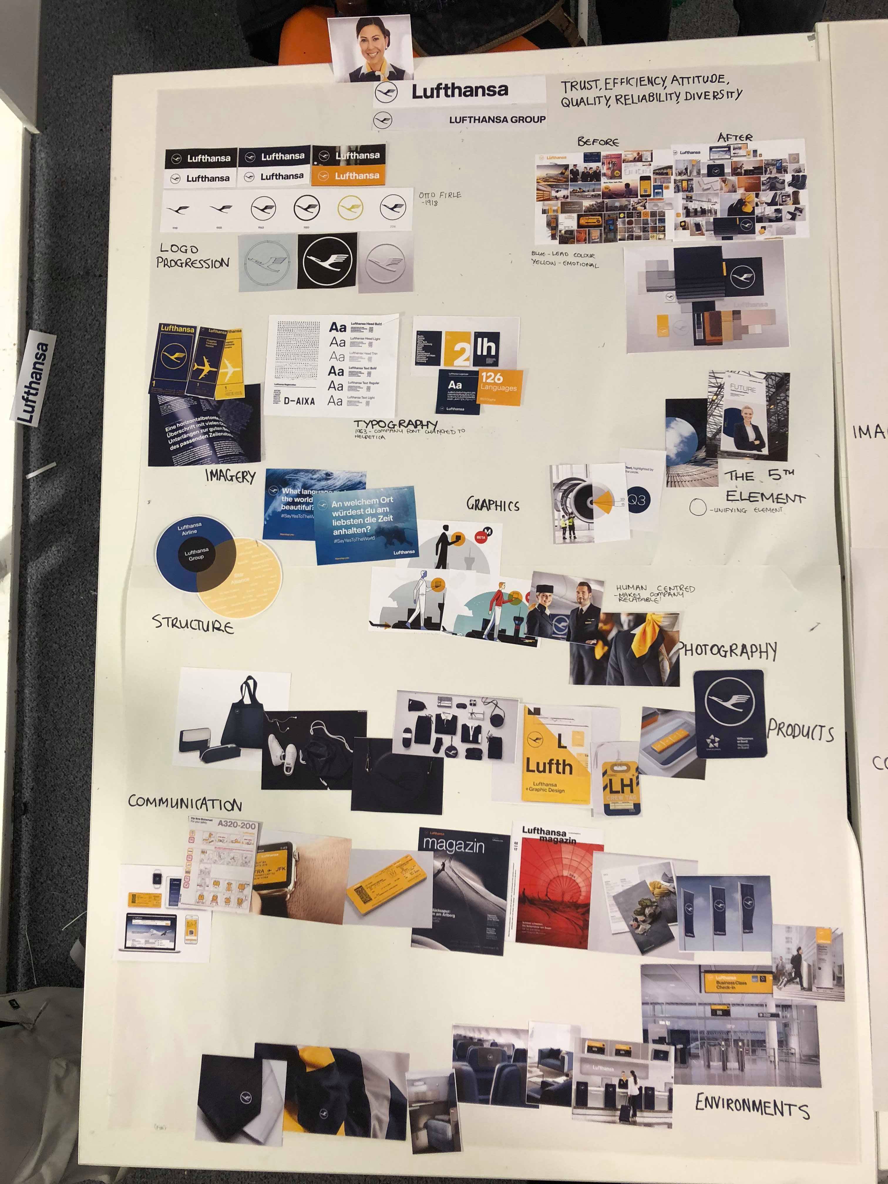
Lufthansa nowadays has a very strong colour arrangement, due to the design consultancy that implemented this change is the way that they present themselves. Its the discipline to coherence and uniformity that resonates with me as these colours instantly tell you that that is Lufthansa and nothing else.
And so it was taken into serious consideration for us as we ourselves could see the huge impact colour can have on a brands identity.
And so it was taken into serious consideration for us as we ourselves could see the huge impact colour can have on a brands identity.
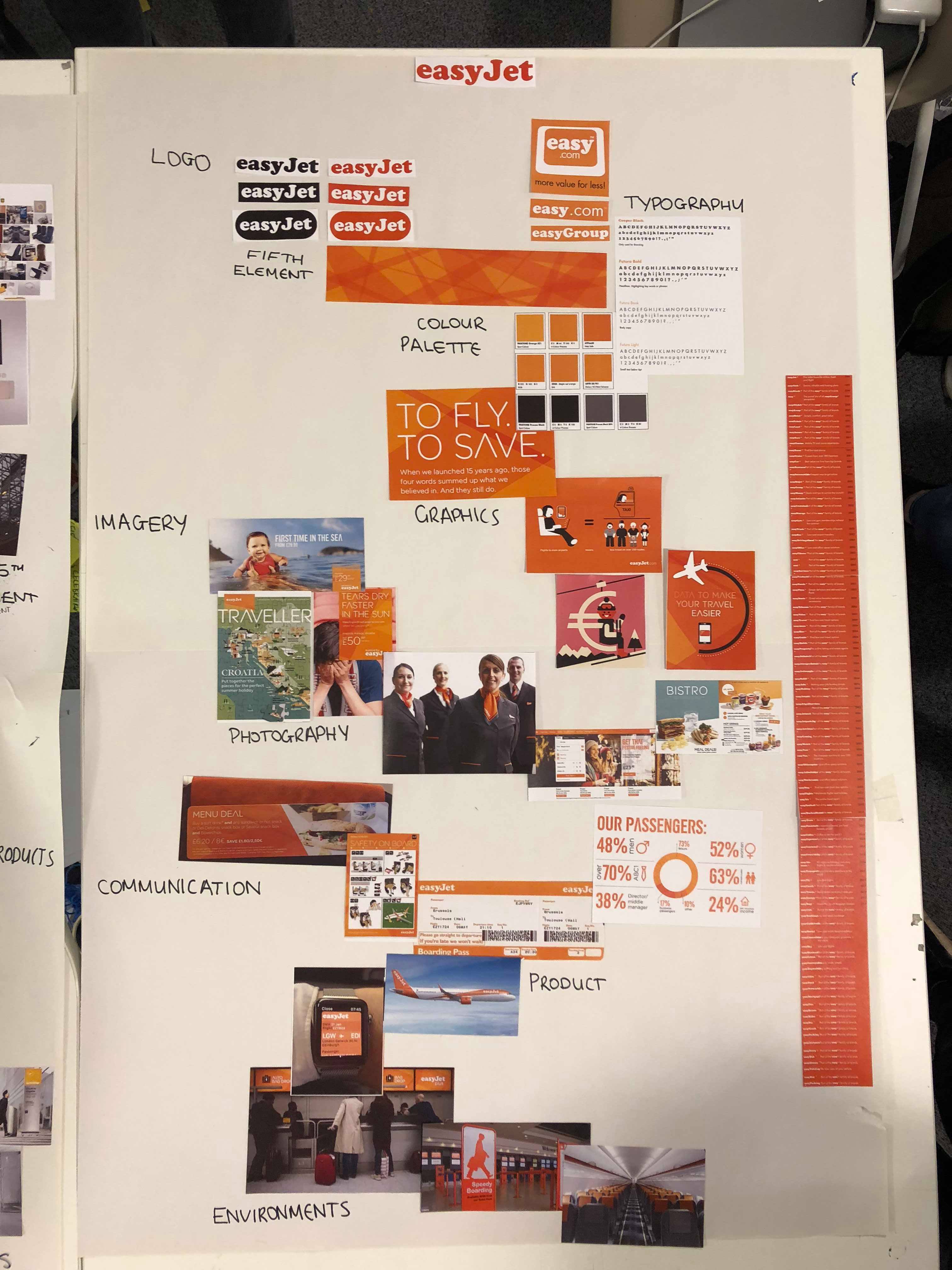
However for Easyjet I wasn’t as impressed as they contradict themselves by saying they take on the big guys while they sue independant shops for having the word ‘easy’ as their first word regardless of th spelling. Also with such a loud colour to be presented with, Easyjet does not offer you the same standard as the more modestly coloured Lufthansa and if you do you want those ‘luxuries’ it comes as a extra cost. The only advantage to this colour is like Lufthansa when you see it you know who it is.
And so the first two and a half days were spent doing visual research of the brand as you can see from the previous two pages, and on the Wednesday morning of that week we were to present our findings more specifically we discussed our thoughts on the brand in terms of the positives and downfalls, graphical elements, brand manifestos, their ideals etc...
For the second half of the week we were told to create a visual identity for our future brand by using the techniques that we learned at the start of the week. Myself and Catarina were very excited at this moment as we both enjoy graphic design and branding design so we were very much in our element at this point.
For the second half of the week we were told to create a visual identity for our future brand by using the techniques that we learned at the start of the week. Myself and Catarina were very excited at this moment as we both enjoy graphic design and branding design so we were very much in our element at this point.
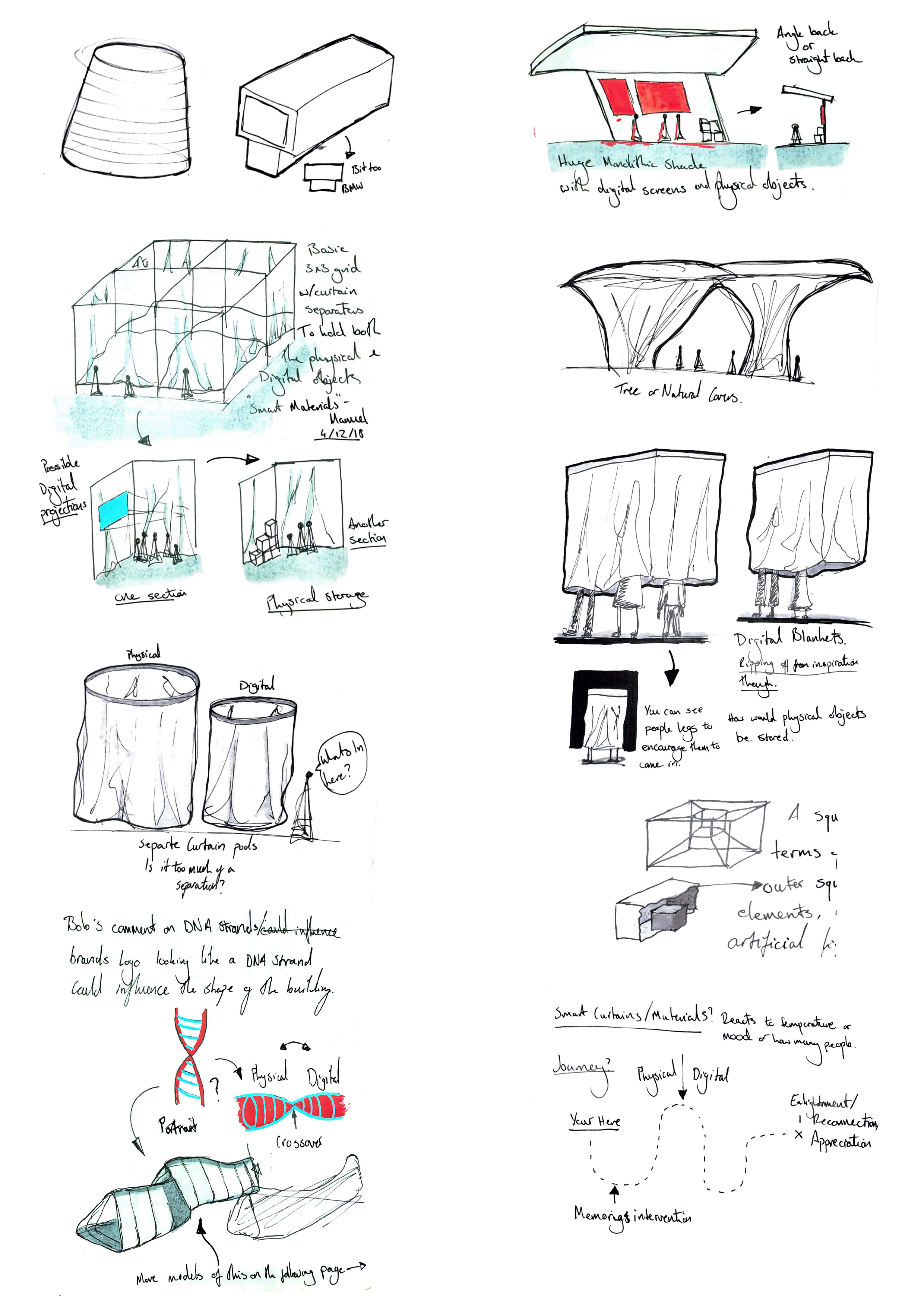
From Sketch to Screen
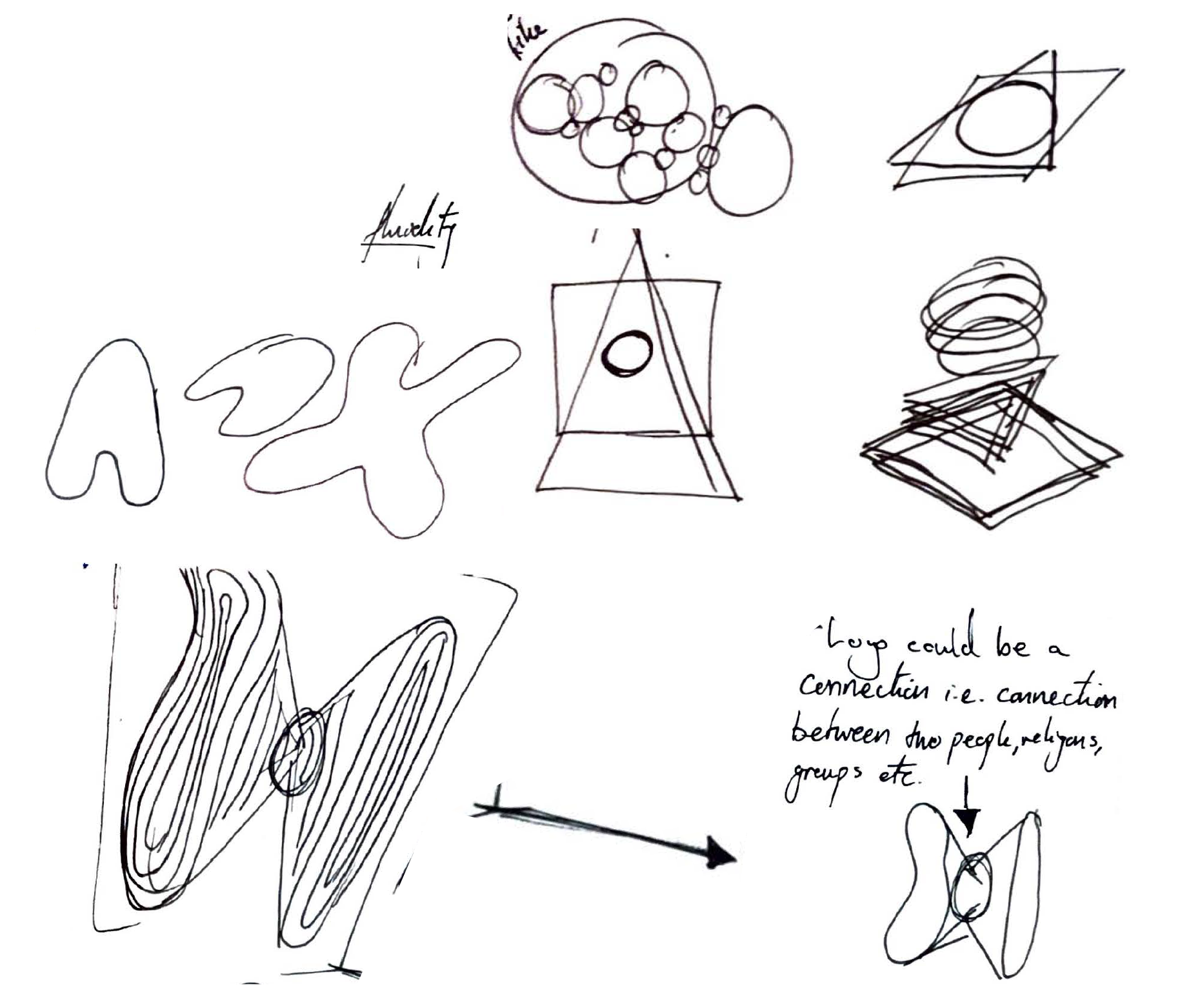
When creating the logo for our brand I began to ask myself what will people look like in ten years? As gender and the idea of identity become more and more fluid then the logo should represent this.
The following images are a development of shapes that resulted in the final chosen design representing the connection made when two people come together.
The following images are a development of shapes that resulted in the final chosen design representing the connection made when two people come together.
Logos Black on White Background
Logos Coloured on White Background
Logos White on Black Background
Logos Coloured on Black Background
The Chosen Logo Design.
The Brand DNA
Once we had created our logo, gathered reference material and images, we presented our brands visual identity to our peers for further feedback and refinement.

Finding and Developing the Moment