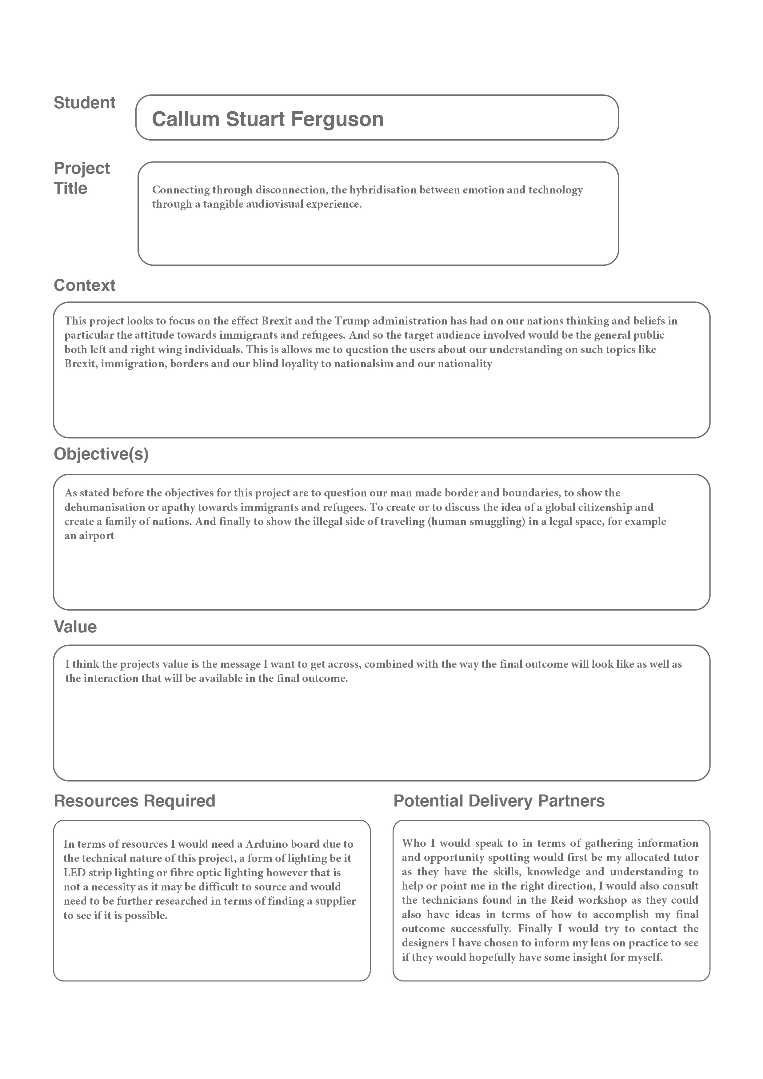
Self Initiated: Periphery
Project Length: 6 WeeksPeriphery is an audiovisual experience where the participant(s) face the terrible prejudices of our modern world, by witnessing the perilous journey refugees and immigrants go through to escape what was once their home.
Periphery is an intervention for change, the start of a much needed discussion about how we treat each other while questioning the meaning and necessity of borders in our connected world today.
The Initial Brief &
The Theme
With my first draft of my lens, the brief, my chosen theme and possible directions to go in I consulted with my tutor about what areas/ practices interest me so that I can gain tailored feedback and direction when moving forward. We discussed the theme of family and whereabouts I would like to introduce my intervention. I looked at several areas: the first being reconnecting families as technology has begun to diminish relationships between family members, the second area is family separation as political movements like Brexit and the Trump administration are either tightening or closing their doors to immigrants with international families are being affected by this greatly.
The feedback I received helped me focus on what direction I should go in as I shouldn’t take up anymore time that would interfere with researching and initial ideation.


Identifying issues and
Choosing a direction
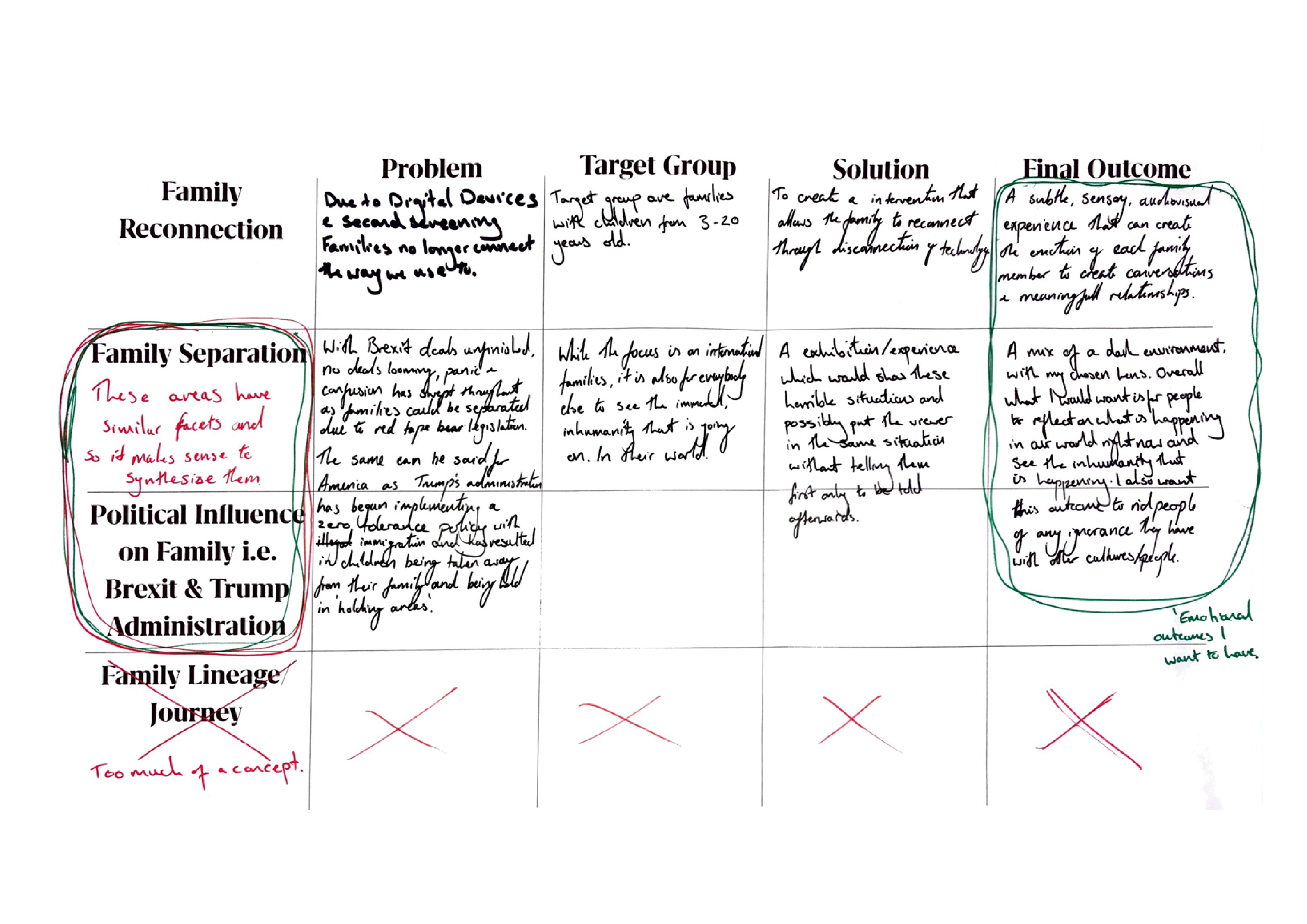
Above is a map of the previously mentioned issues I wanted to tackle and so in order to see what area would interest me and provide me with plenty of design opportunities I filtered the issues through their: Problem, who their Target Group are, the Solution and what the Final Outcome would be.
It was then that I realised that two of the ideas could be synthesised into one as they dealt with similar themes. This helped influence me when coming to a final decision and so had I had I created this task for myself at the start I would saved time for future researching and concept creation. If in the future I find myself in the same situation of having several directions to go in I will lay it out in a similar fashion.
'Lens on Practice' &
The Emotional Outcomes
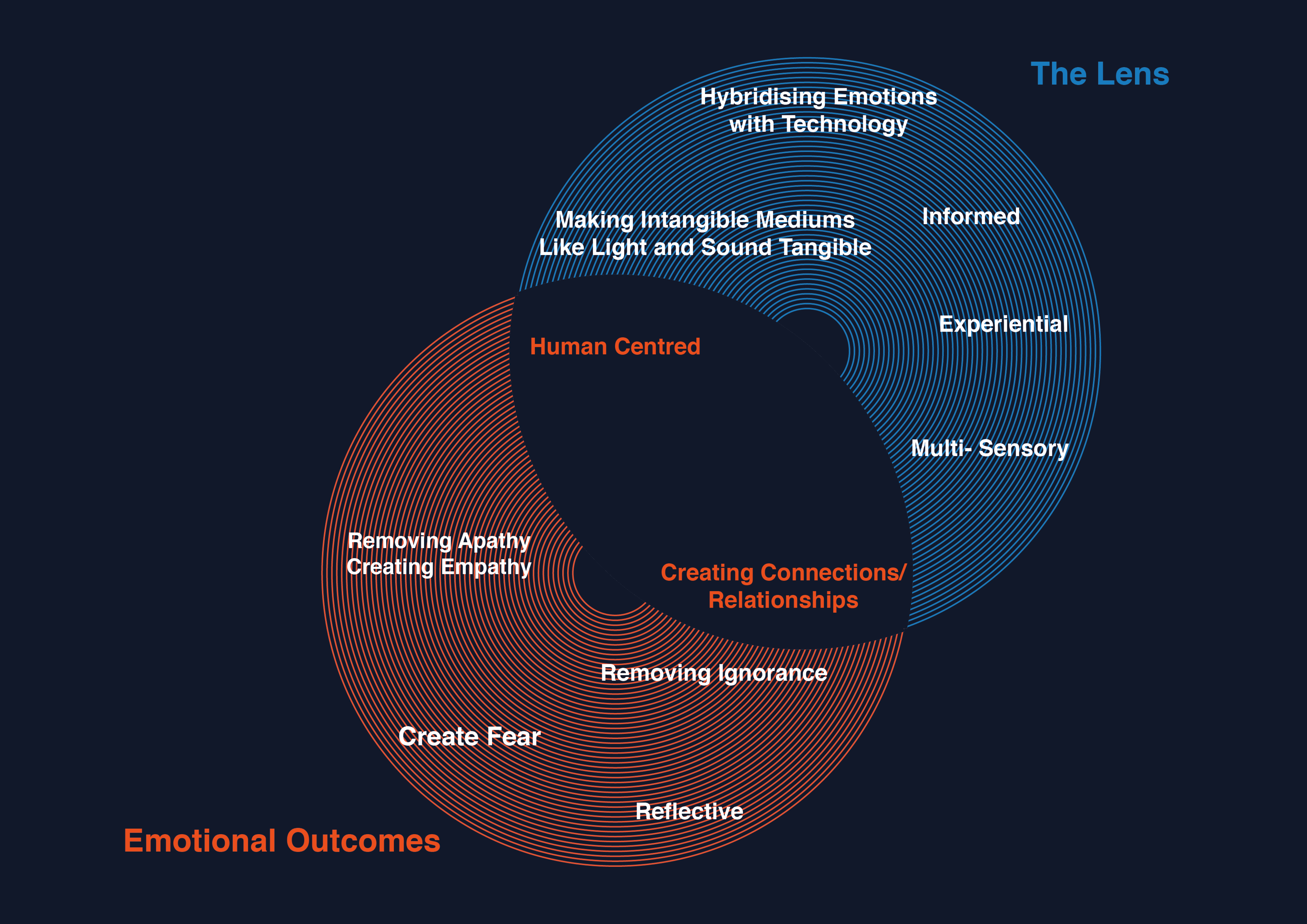
And so after collating both my lens and emotional values I decided that the best way to present this was through an infographic to help illustrate clearly what my practices intentions are.
The area with orange text symbolises the shared values of the Lens and Emotional Outcomes in that they both have a human centred focus and that their intention is to create connections as well as relationships in whatever form that may take.
Statistics &
I then began with initial research that looked at what Trumps administration is doing to immigrant families and how Brexit will affect the UK and international families. To present a heavily worded statistic sheet is difficult as the viewer would get lost in text and so I decided to highlight the specific percentages and facts to draw attention to the viewers eyes. This was particularity useful when it came to the group presentation as it was easy for people to understand the data rather than larger blocks of text.
However had I more time I would like to put this data into an infographic to help deliver the statistics further and create a bigger impact as some of the facts here are quite shocking.

Phenomena
From the research I found several phenomena’s that indicate that there are further developments and directions that I could go in. The one that caught my attention the most was the “If I Knew Then What I Know Now...” phenomena as tackling the public general ignorance and challenging the governments propaganda seemed a difficult but alluring task.
Researching Design Activism
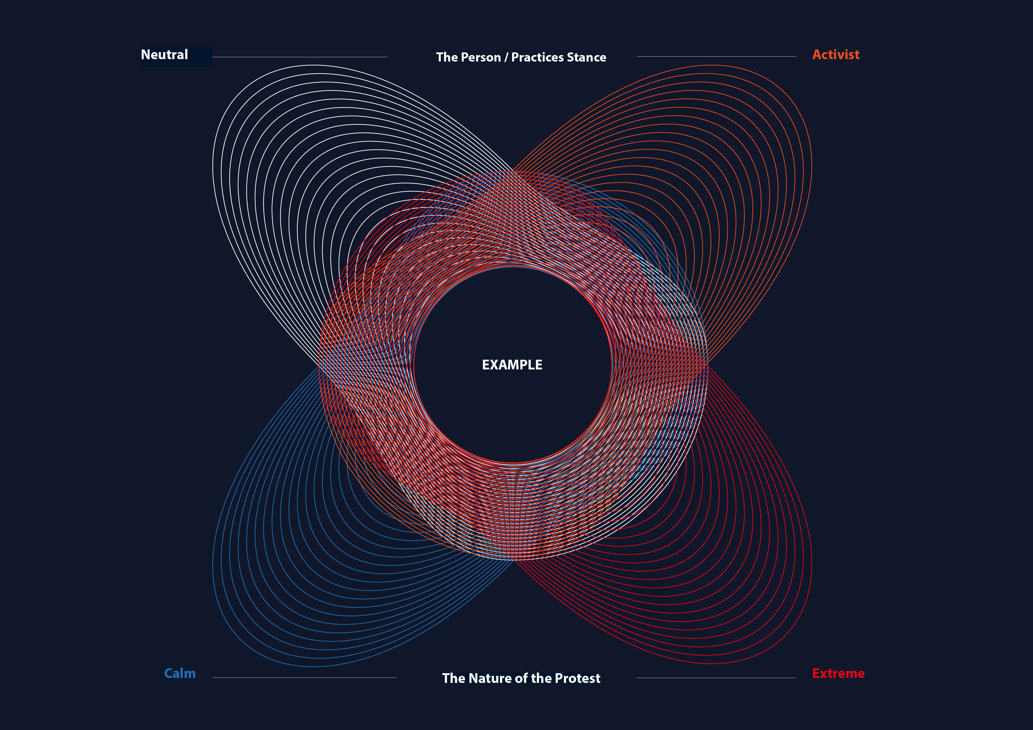
"Generative Activism Is A Constructive Way To Understand Design Activism And Its Power To Bring About Change"
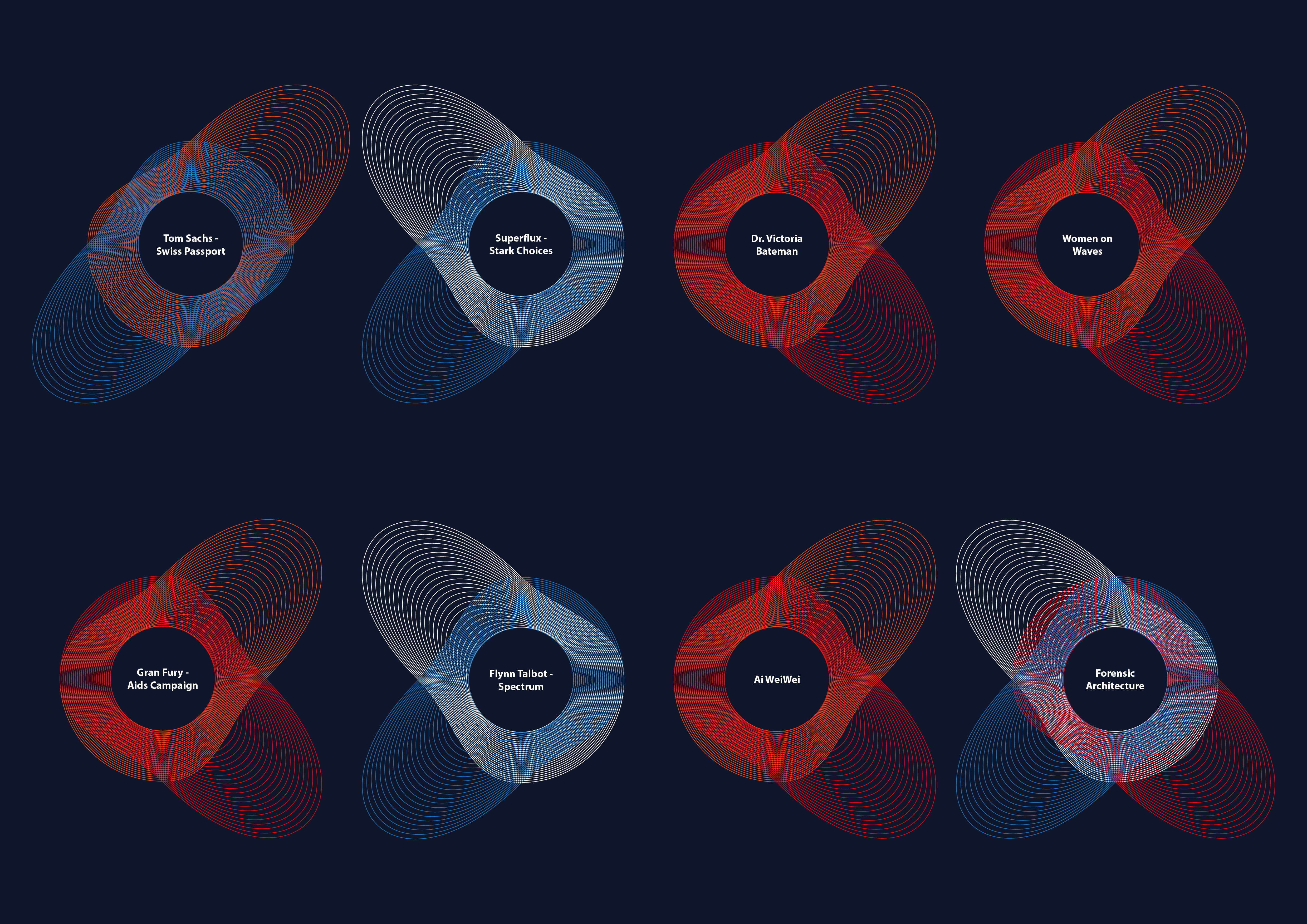
To get a better visualisation as to what I found in my research I decided to map each artist, designer, company, and individual into an info graphic (as seen below). The top two colours indicate whether the person or practice is either Neutral on their chosen subject or an Activist. While the bottom two colours represent whether the nature of their protest was done in a Calm manner or Extreme manner.
The specific examples of activists I looked at were:
Tom Sachs’- Swiss Passport Office
Superflux’s- Stark Choices exhibition
Dr. Victoria Bateman’s Protest on Gender inequality and Brexit
The Women on Waves Organisation
Gran Fury- American Aids Campaign
Flynn Talbot’s- Spectrum
Ai WeiWei’s Artistic Forms of Activism
Forensic Architecture’s Overall Work
What I noticed throughout this research that although we have protests, votes, sit- ins etc. That for example are challenging the Brexit vote in that the public and several ministers are asking for a second referendum it still hasn’t stopped the process. And so the question asked here is, is what we are doing here? Are all our efforts futile?
However after reading Ann Thorpe’s article Design as Activism: to resist or to generate I realise that this a common question asked especially among the art and design discipline however Thorpe states that this is a common misconception that is explained further in her essay which I implore everyone to read.
And so after seeing many examples of activism I began to create concepts of my own that were influenced by these examples however done through the filter of my lens.
Generating Concepts
With the statistics and inspiration from the various forms of activism I then began to create concepts that would suit the brief I created.
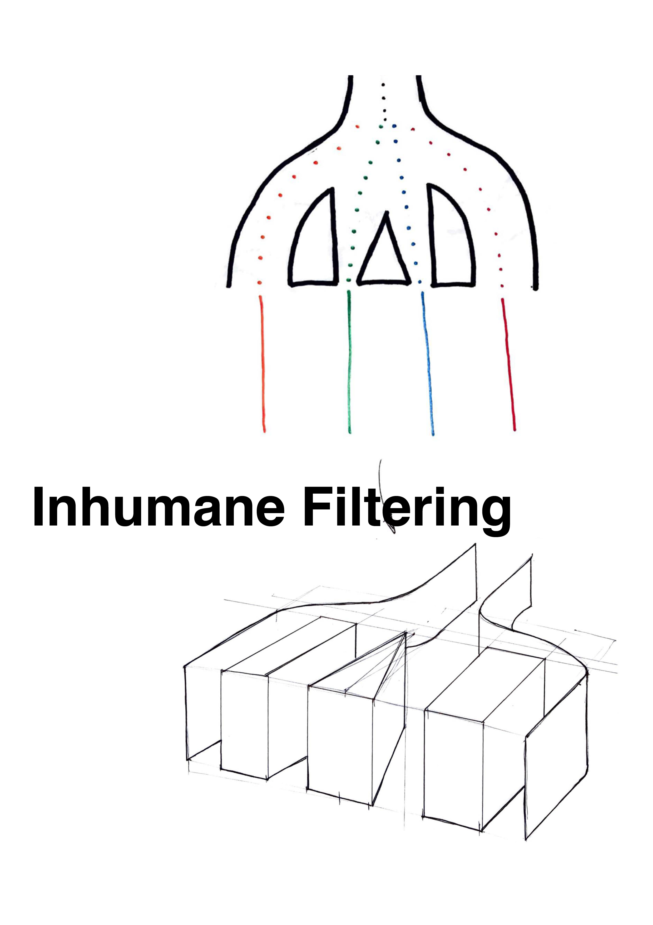
Inhumane filtering- involves being separated from our loved ones, the filters for separation can include difference in gender, nationality, regionality, religious beliefs etc... Each pathway leads to a morbid or uncomfortable experience ending with the public being reunited with their loved ones. This will hopefully create a sense of what is happening to those families who are being persecuted in other countries.
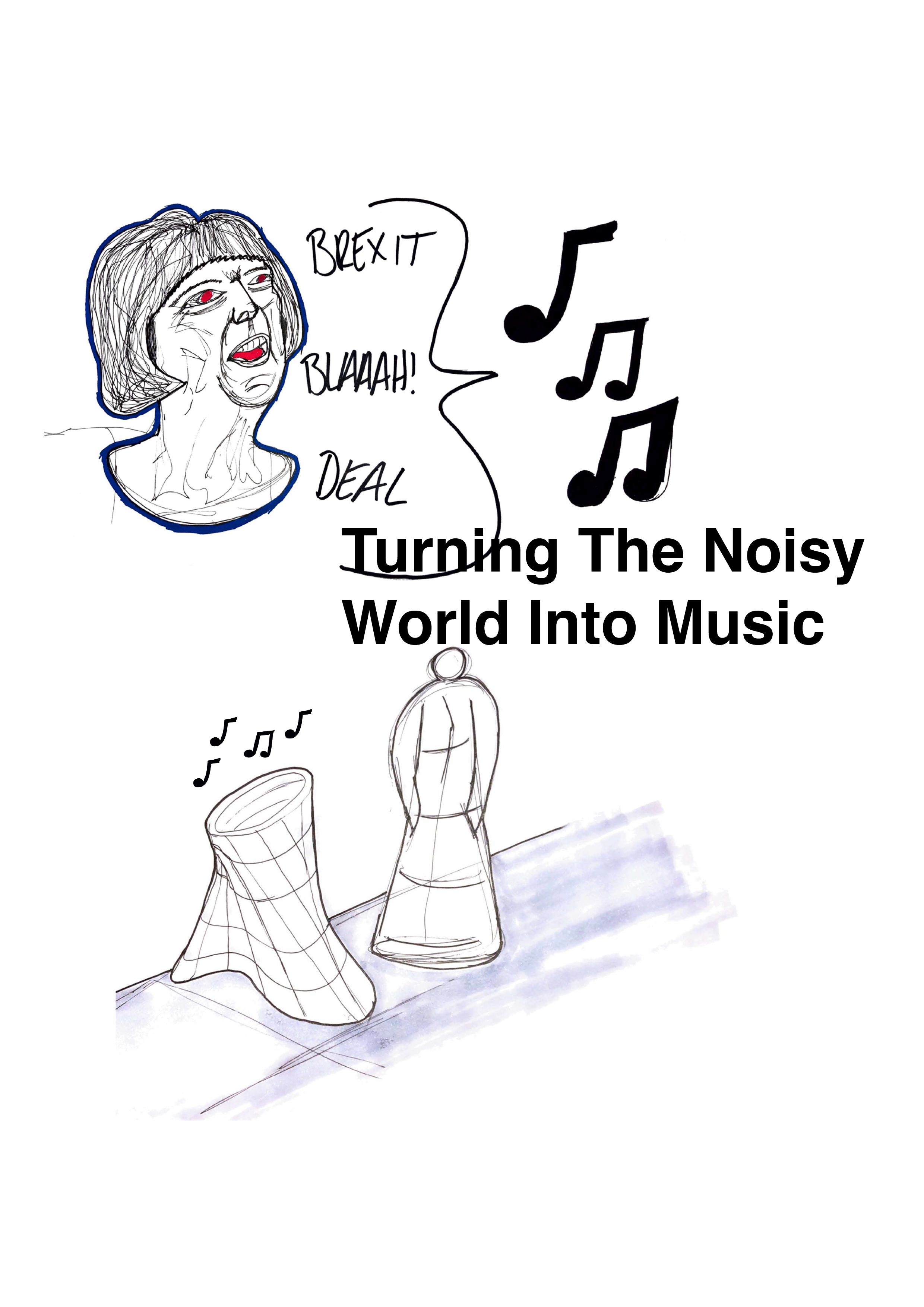
Turning the noisy world into music- With the constant barrage of news, misinformation and Brexit’s coming and goings we are not only more confused than ever but we have became fatigued and what’s worse is we are becoming agitated and ignorant to one another creating divides with our family members arguing over what facts are true and false. So to combat this, a vessel or screen or area can transform the barrage of news into music creating a more peaceful and relaxed atmosphere giving the ability to tune into the news whenever you want.
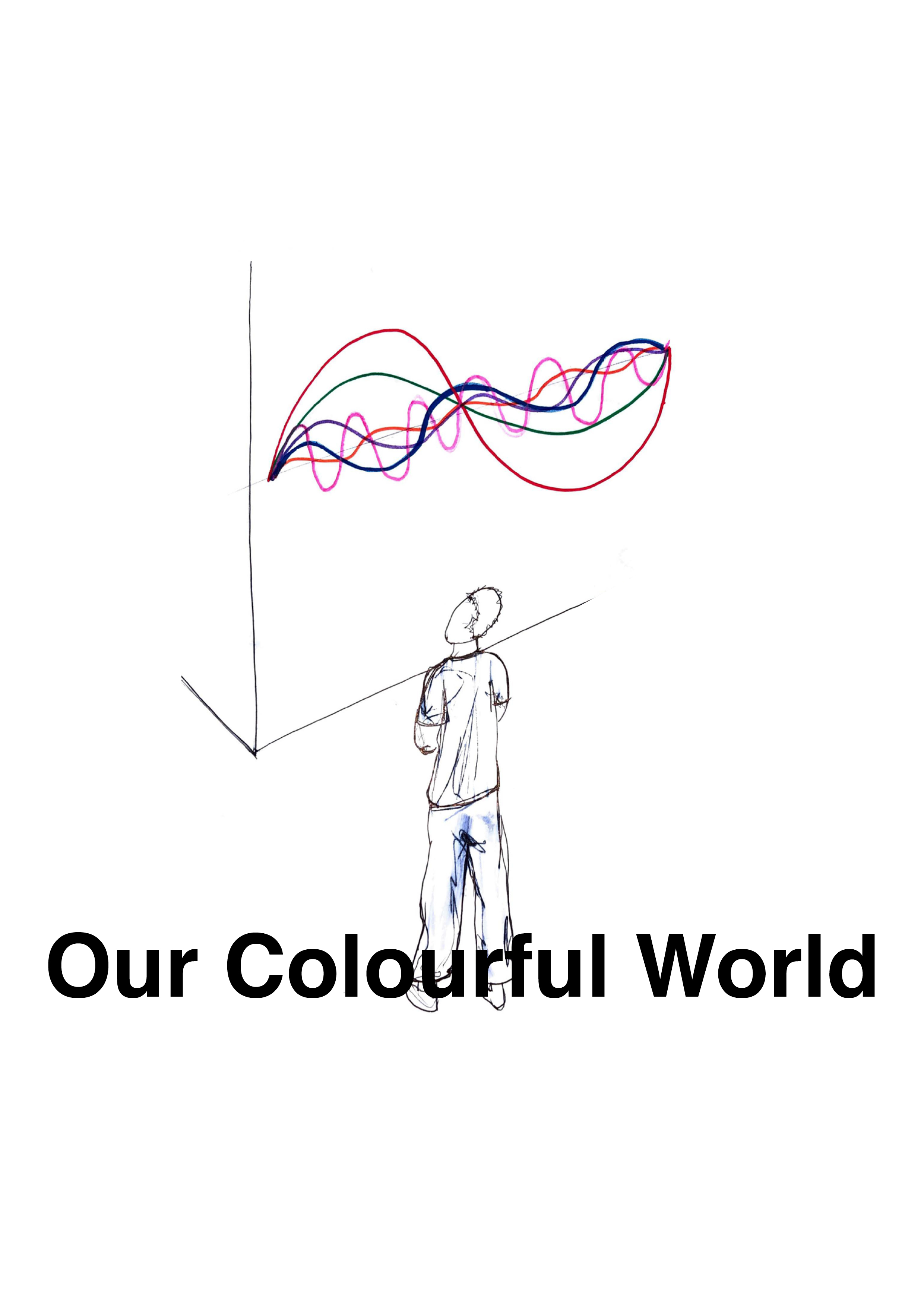
Our colourful world- A piece of sculpture or audiovisual that shows the current amount of international citizens in that given area the colours determine the nationality and the amplitude or number of waves denote the amount of that given nationality in the area. The more colours the more culturally diverse the area is. The possibility to add music to this concept would be a probability.
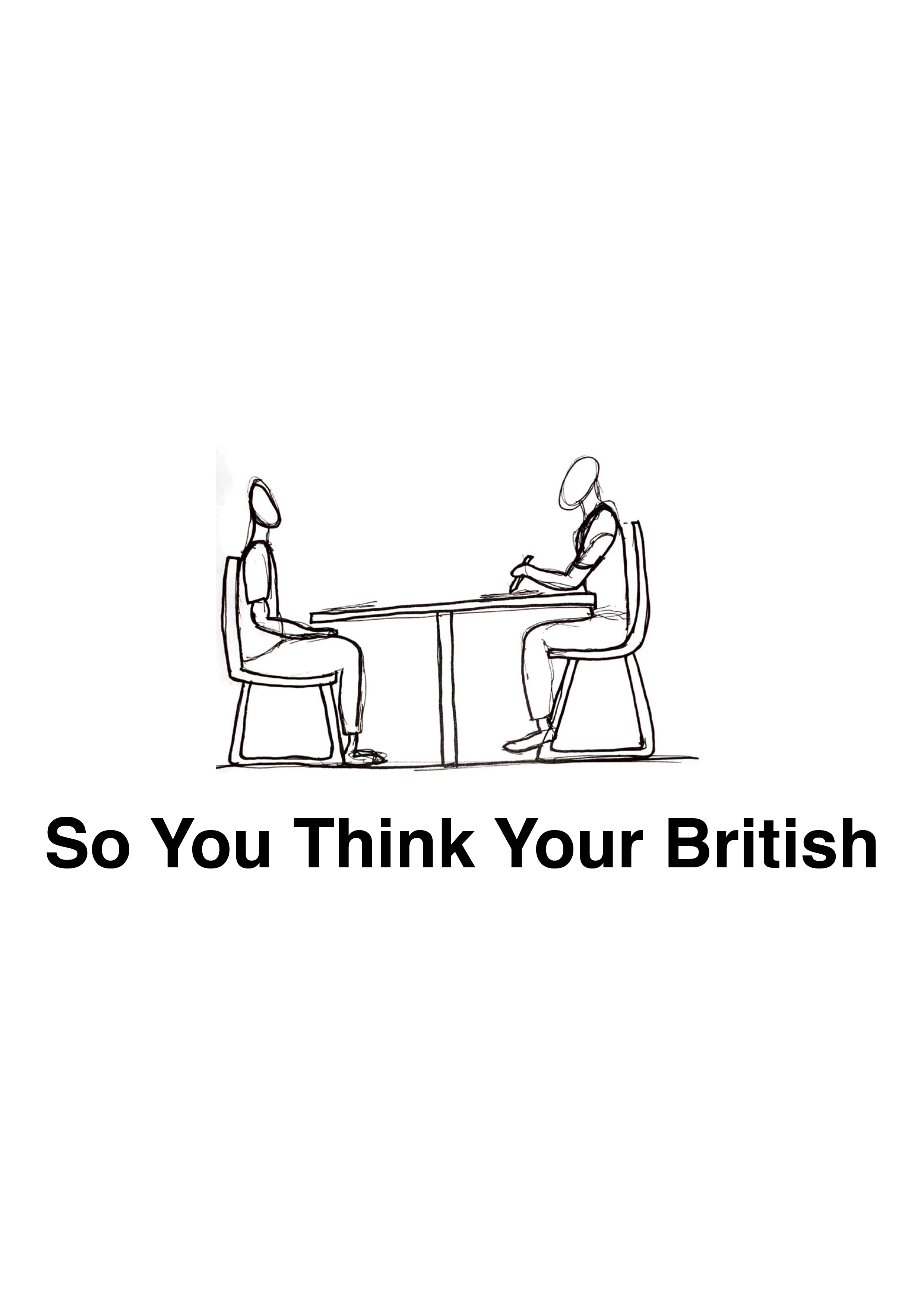
So you think you're British?- Inspired by Toms Sachs work as well as other sources of inspiration like Blade Runners Voight Kampff test and Alan Turing’s imitation game or as its known nowadays as the Turing test, this test will involve invasive questions such as your nationality, your parents and ancestors nationality, any benefits you claim your annual wage, where you live to see if you qualify to be a real Brit.
Family Lineage- an interactive exploration of your ancestors journey from where they began to where they are now. Where did you come from? What countries have your family transcended? What facts can you find? This concept looks at how we are global citizens and not just national citizens defined by our borders.

Redrafted Final Brief
The Synthesis of Concepts
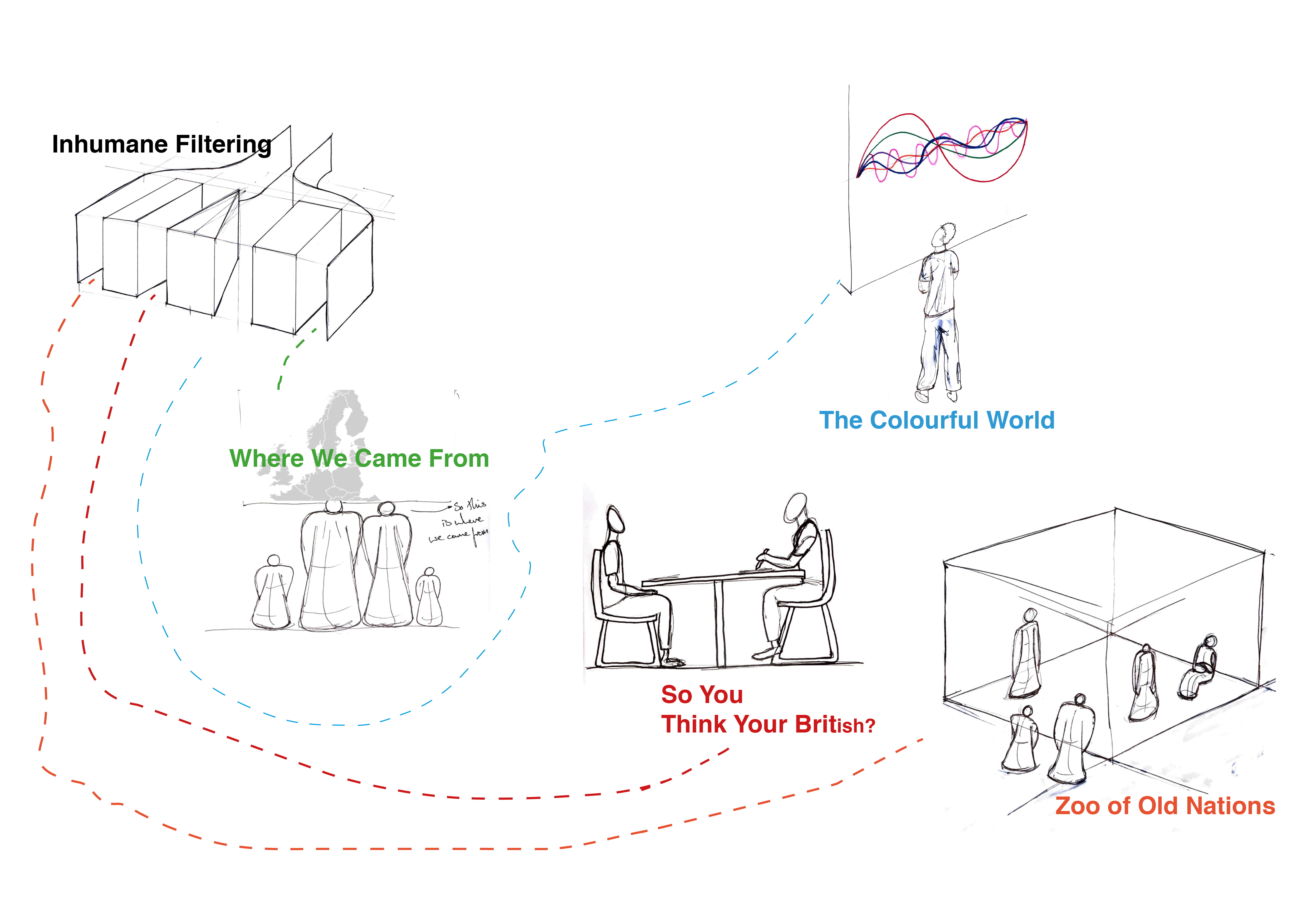
After settling and completing my final brief , I began to think that it could be interesting to combine these concepts together to make one strong idea. For example the concept Inhuman Filtering would be the beginning where the users would be split up into the various pathways.
Some going to the Where We Came From pathway where the user has the opportunity to see where their family lineage began through an interactive map.
Some going to the Where We Came From pathway where the user has the opportunity to see where their family lineage began through an interactive map.
Or The Colourful World where the user would be shown how many multicultural communities are living in the area to help remove the stigma that has been created over the years by politicians and the like.
Another pathway would be So You Think You're British? where the user ( in this instance a British individual) will be heavily interrogated and made uncomfortable to simulate the difficulties immigrants go through when immigrating to another country.
Another pathway would be So You Think You're British? where the user ( in this instance a British individual) will be heavily interrogated and made uncomfortable to simulate the difficulties immigrants go through when immigrating to another country.
And the final pathway would be the Zoo of Old Nations where British citizens are kept in a glass box displayed to the rest of the European countries to show the bygone era that voted for Brexit.
But, What If?...

As interesting and fun it would be to combine all the concepts into one idea would result in my opinion to be too much work in a short amount of time to which the end result would lack quality and cause confusion creating a lacklustre final outcome. I decided instead to flip the direction as, in reality, that is the case. Millions of people from all around the world being siphoned into airport customs and immigration control to get to the other side.
So I began to refocus my intentions with this project and decided to look into the idea of borders, this man made construct which we hold dear to our hearts either due to or sense of patriotism or nationalism or due to mass conditioning and indoctrination.
National Identity &
The Border Phenomena
When we talk about our national identity what do we mean? How do you identify yourself? Do you identify with your country and its people? Your city? Your family name?
It's a concept which has caused divide, violence and even war.
Nowadays with social media we have created a whole new form of identity one that is majoritively untrue as it portrays an identity of who we would like to be rather than who we actually are. However looking at how the government identifies us is through formal identity cards or passports two of the most important things to have in our modern society especially since the United Kingdom’s passport will be making a change at some point in the near future, though with the current political climate right now (specifically April 2019) Brexit changes by the hour.
After looking into national identity I then looked at border phenomena. As a concept it is quite unusual to be told that this line on a map states that this is the separation between one country and another, however when you pass that border in reality it is still the same road and same surroundings nothing is drastically different. What the line really represents is where one political parties jurisdiction ends and the other begins. And so as stated before this was an area I wanted to challenge to start a conversation of global citizenship and create a family of nations.
The image below is a model made by the company Italian Limes showing the Italian Border Phenomena. As the border is surrounded by snowfields and ice sheets and because of global warming the glaciers move considerably, it thereby creates a ‘Moving Border’ which has been introduced by the Italian Parliament into national legislation showing that there is leeway in this area.
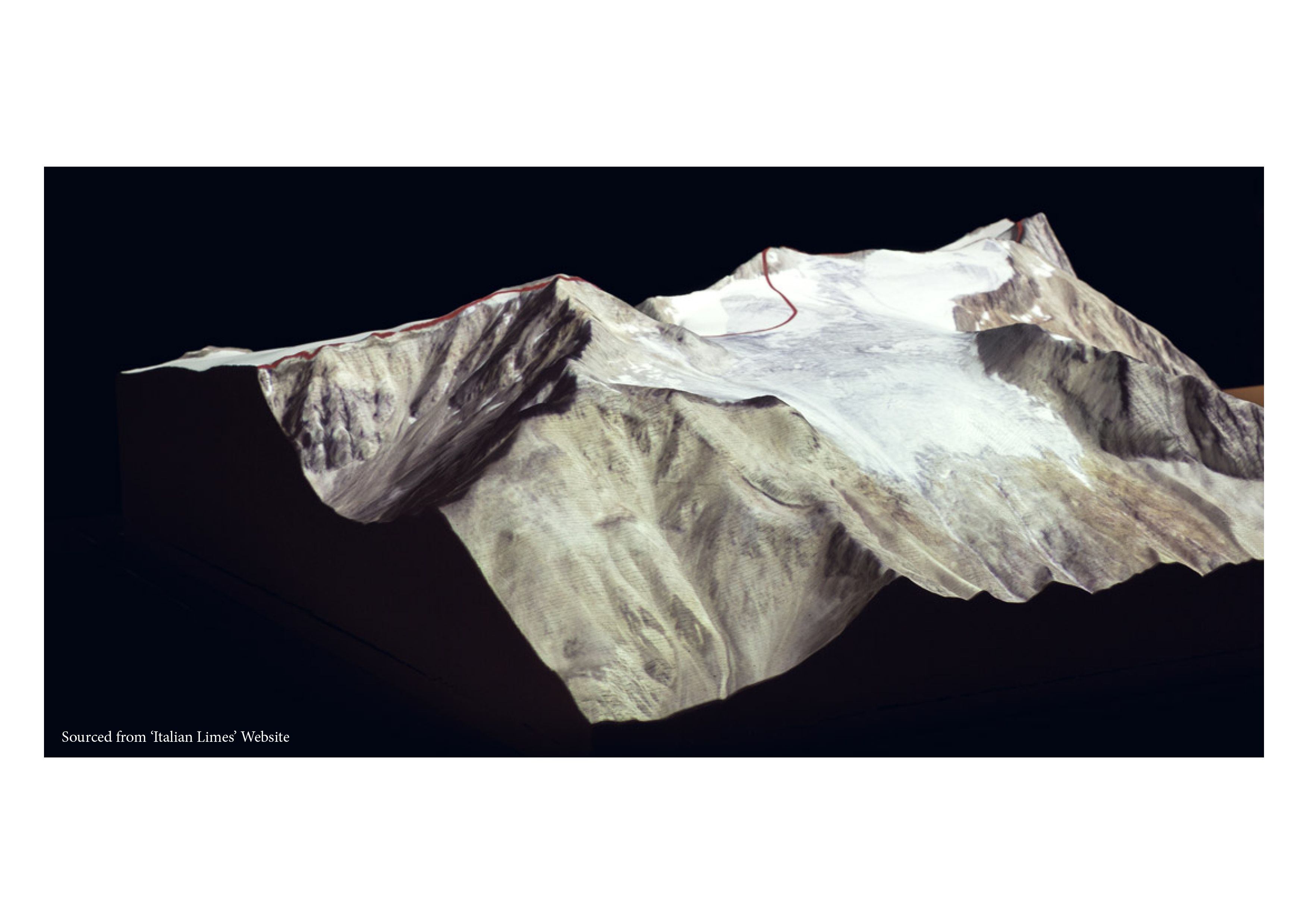
This phenomena further shaped what my intended outcome was to become. The idea that there are shifting borders in our world helped solidify, in my mind, that borders are indeed lines on a map that I feel need to be challenged in hopes to create global citizenship or a family of nations. From here onwards I continued to research the border phenomenon but also the idea of national identity as the two are interlinked.
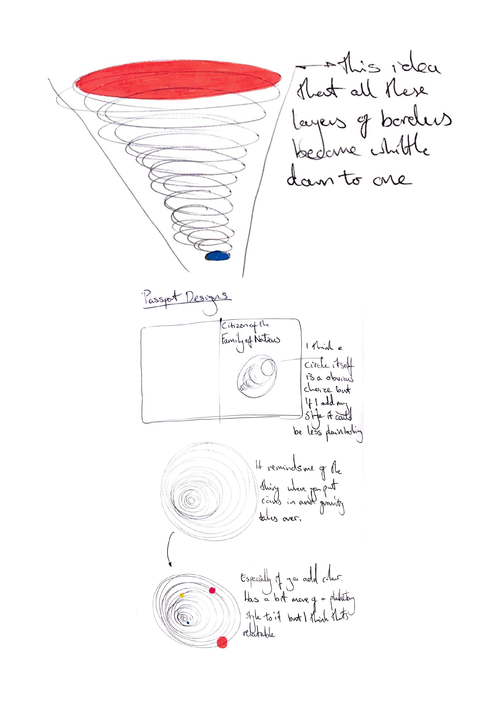
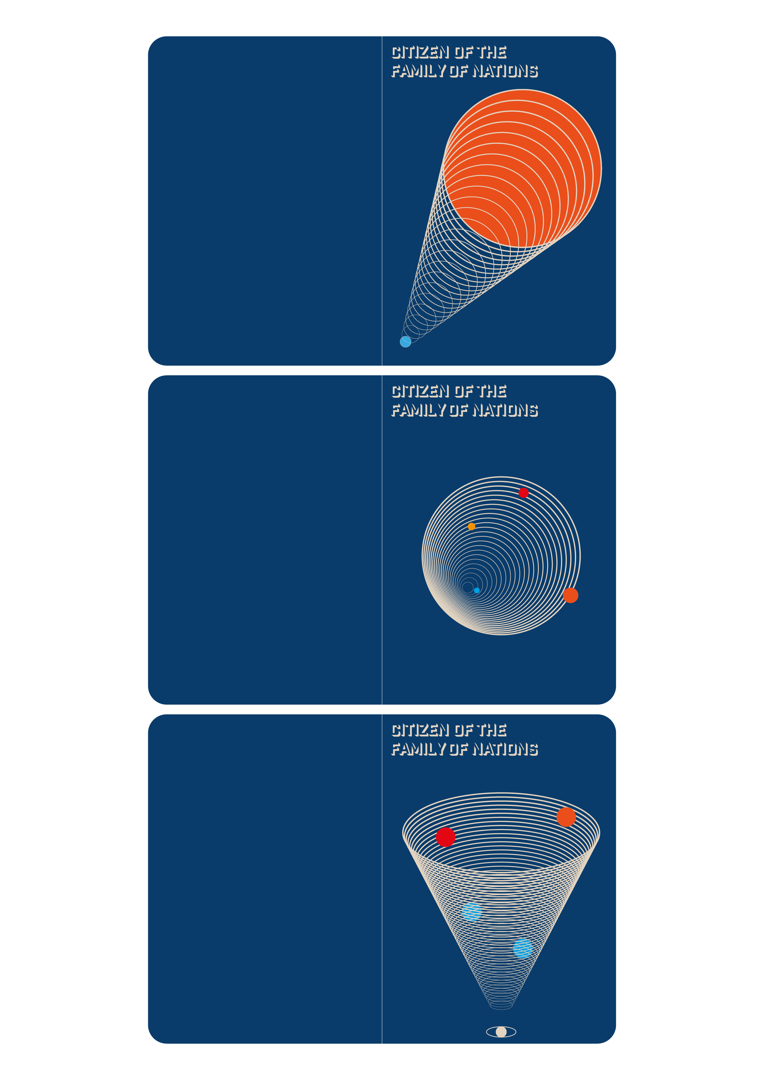
After being inspired by the research and insight I gained I began to create my own versions of passports with the intention that it would be available to every one, the world should only need one passport to again promote global citizenship. The designs were inspired by the solar system in terms that you have several planets revolving together around the sun I felt that that was relate able in terms of the project.
However at this point I felt as though I was rushing to create an artefact for the sake of creating an artefact as I hadn’t decided on what my final proposal was going to be.
Visual Communication Workshop
with Lee Irvine
During this project we had Lee Irvine run a workshop focusing on communicating our proposals. The intense workshop ran from morning till early afternoon with the objective to storyboard our initial proposals using visuals only to see if our peers could understand the story we were trying to create.
The task was challenging but enjoyable as it made me focus on including every possible detail so that the audience would understand what the story was.
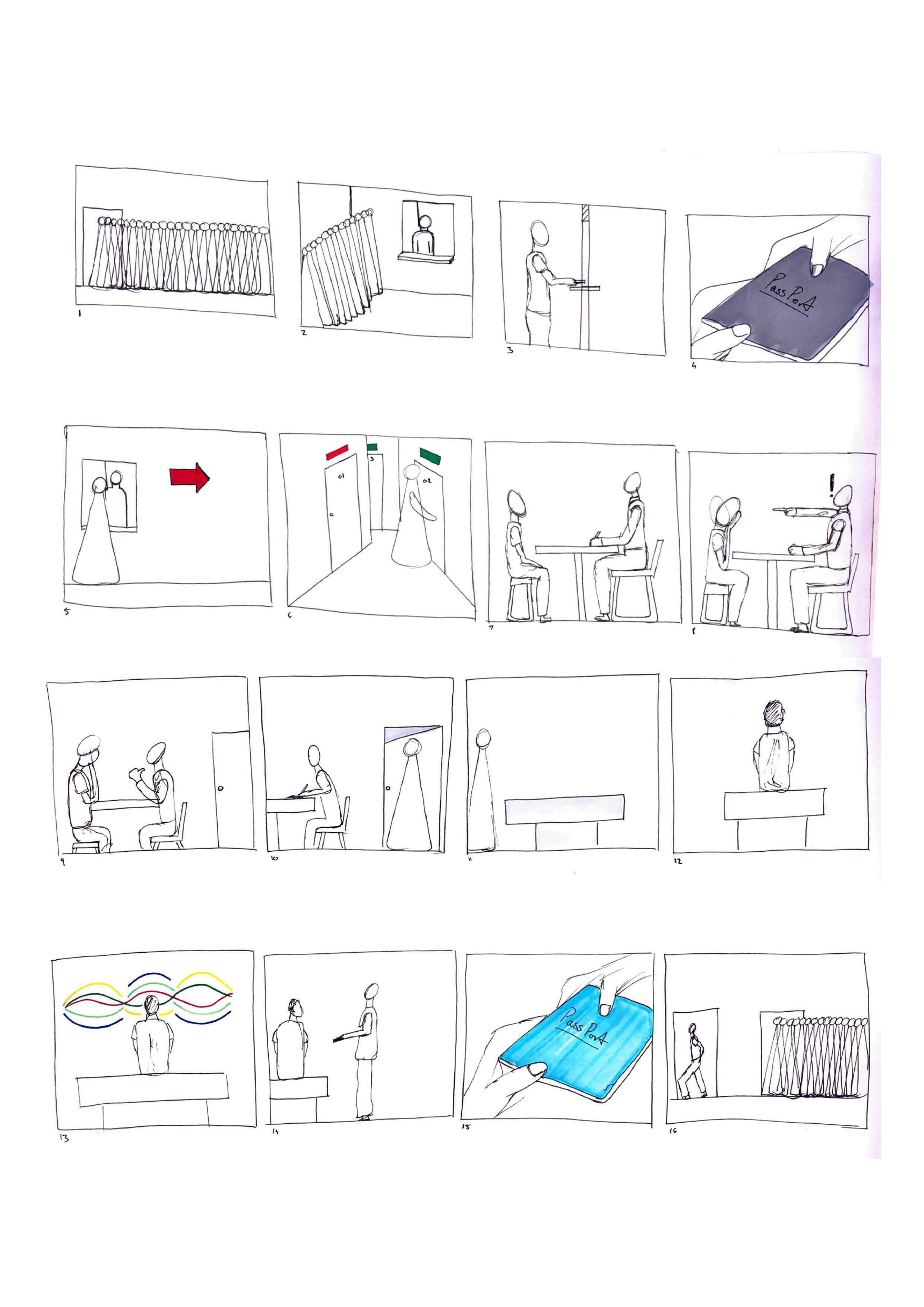
After several hours had passed we pinned up our storyboards and one at a time someone would go up and guess what the story was. When it came for my storyboards to be read it went fairly well though some areas/ details were lost in translation when my peer was trying to decipher the story board.
My feedback and action points to take forward was in this case make the idea of immigration and passports more clear by making it stereotypical so that people get it straight away even as Lee said presenting it in a melodramatic way as it would have helped the viewer or anyone else in the future to understand the story.
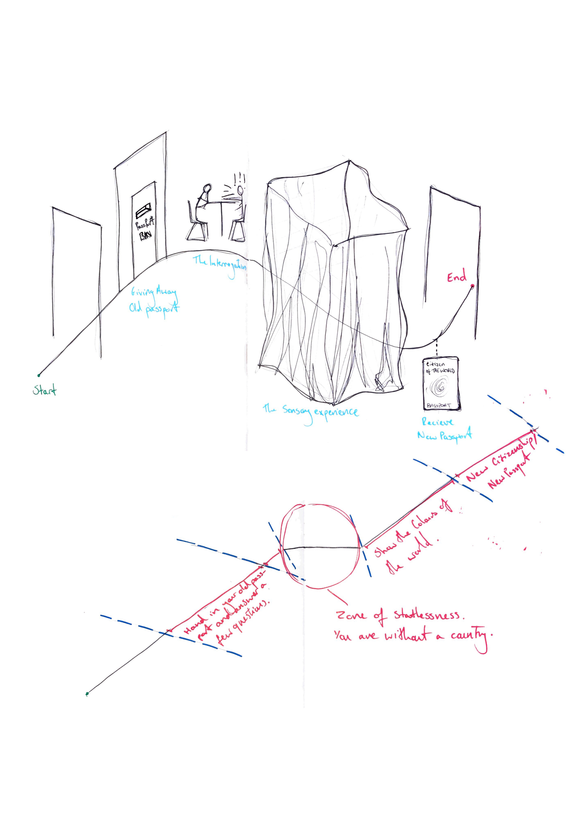
Breaking Boundaries
After receiving feedback from a peer review, the common action point was to focus on the border crossing itself rather than how immigrants are treated as mixing them up may cause confusion and so by simplifying it would create a stronger experience. And so what it reminded me of was the way IKEA directs customers through their showrooms and how there could be some way to use their format and shape it in a way that would be suitable to my proposal.
I began to separate the individual
interventions and describe what would happen to the user in each scenario. I also at this point began to use the who, what, where, why, when, how method to make sure that what I was doing was worthwhile and that there was the possibility of progression, using this method of questioning can bring out the concepts positive and drawbacks and can either make or break a projects final outcome.
interventions and describe what would happen to the user in each scenario. I also at this point began to use the who, what, where, why, when, how method to make sure that what I was doing was worthwhile and that there was the possibility of progression, using this method of questioning can bring out the concepts positive and drawbacks and can either make or break a projects final outcome.
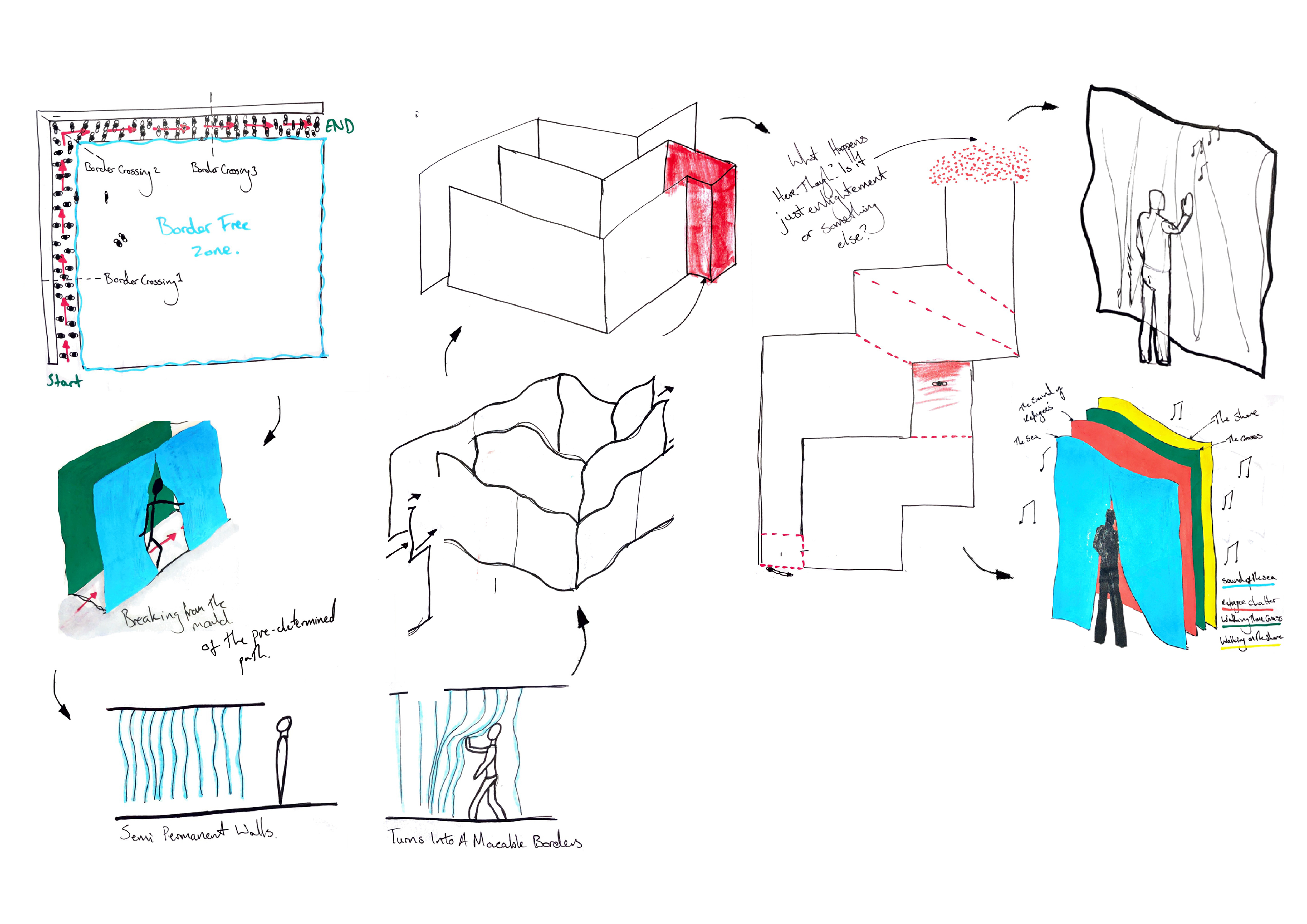
However by using the who, what, why... method I realised that by directing people through this faux border crossing isn’t incorporating the moveable borders that I wanted to include. Which then got me on the train of thought that this border crossing is about breaking from the pre- determined path and removing the idea of borders in the first place.
And so I then began to think that a maze with semi- permanent walls, ideally lightweight fabric, that when the user touched them would play sounds of: the sea, a refugee camp, the shore etc. I chose to situate the maze in an airport environment as the themes involved in my final proposal are the antithesis of what you would find in a clean and modern airport.
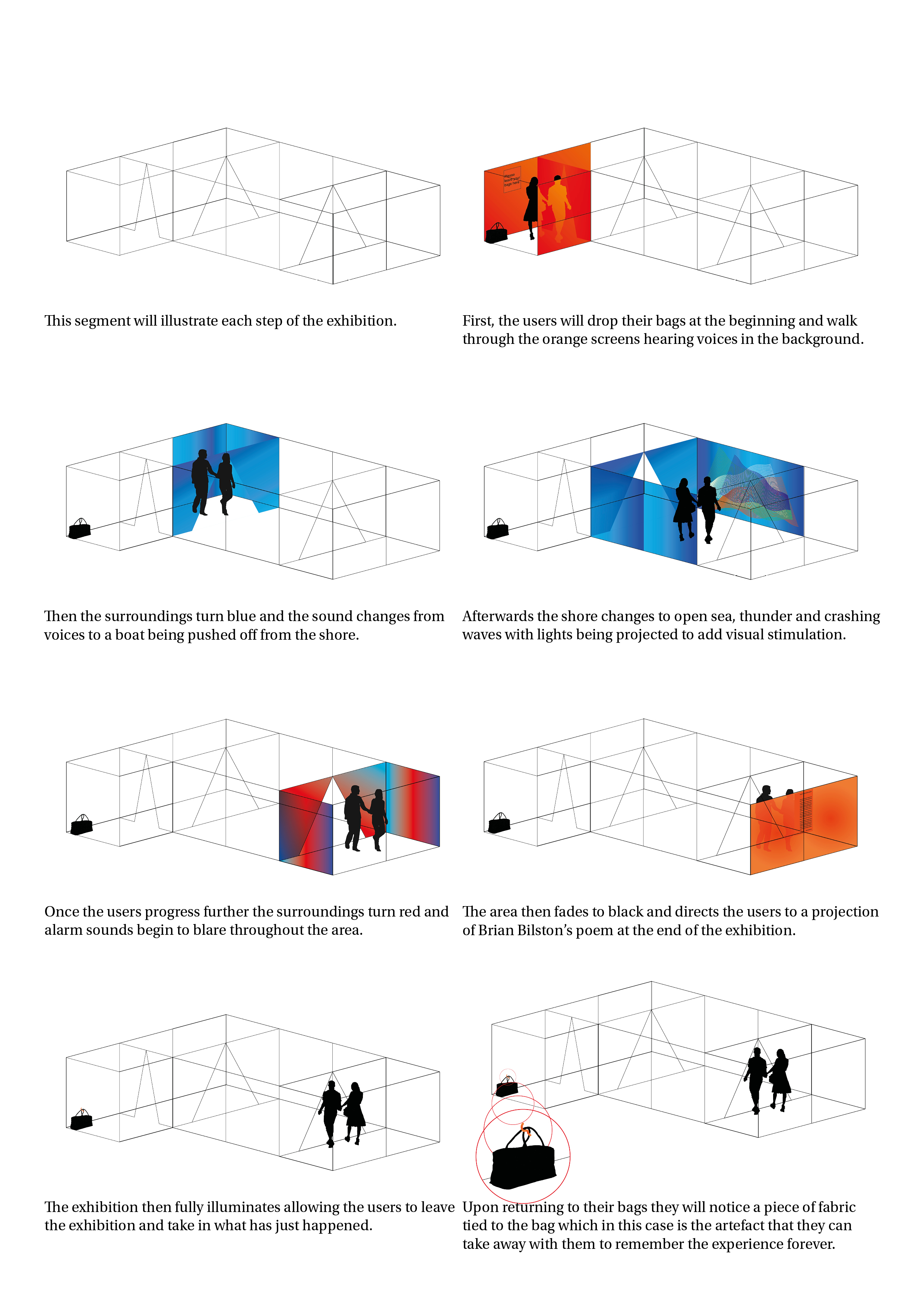
The Initial Proposal
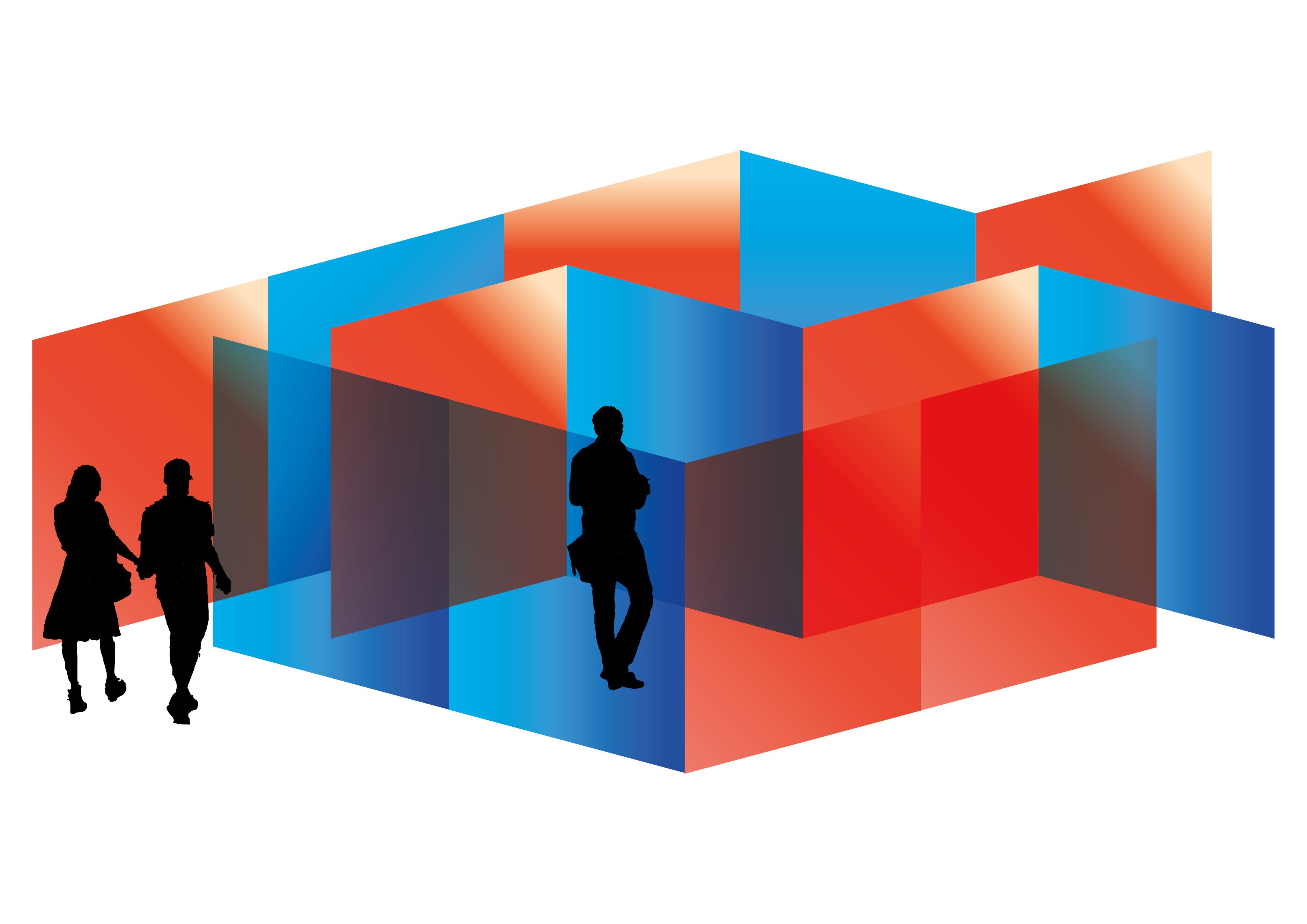

And so this is what the initial proposal was intending to look like a maze in which the users will experience the tough journeys refugees go through to seek a new home with an audiovisual element to heighten the experience. There is a second part of the journey where the user will meet a dead end which highlights the huge loss of life that refugees face when they try crossing the ocean in overcrowded or unsuitable boats/ dinghy’s.
I also thought of making a more artistic exhibition using different colours to tell the story. However I decided against this as it would not have the same impact of navigating through the narrative I wanted to convey.The intended emotional outcomes of this proposal is that the users will: empathise with refugees and immigrants and see them as human beings rather than second class citizens, to reflect on the situation as a whole a demand change and finally remove any ignorance that has been created by influential individuals.
A Story Through Colour
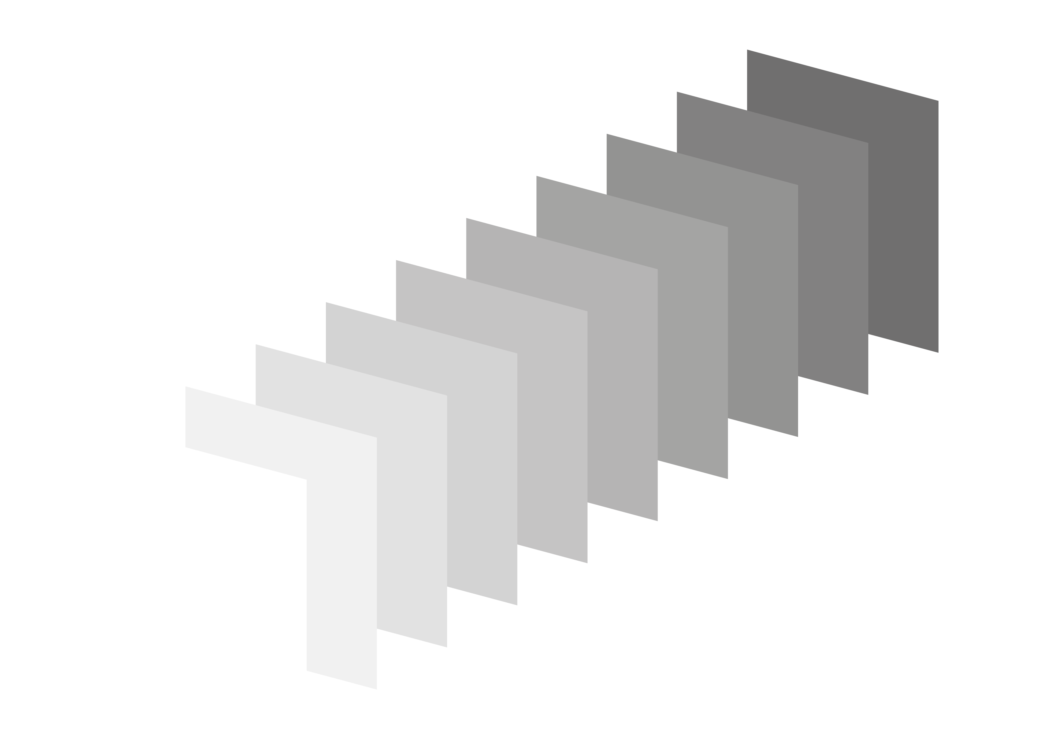


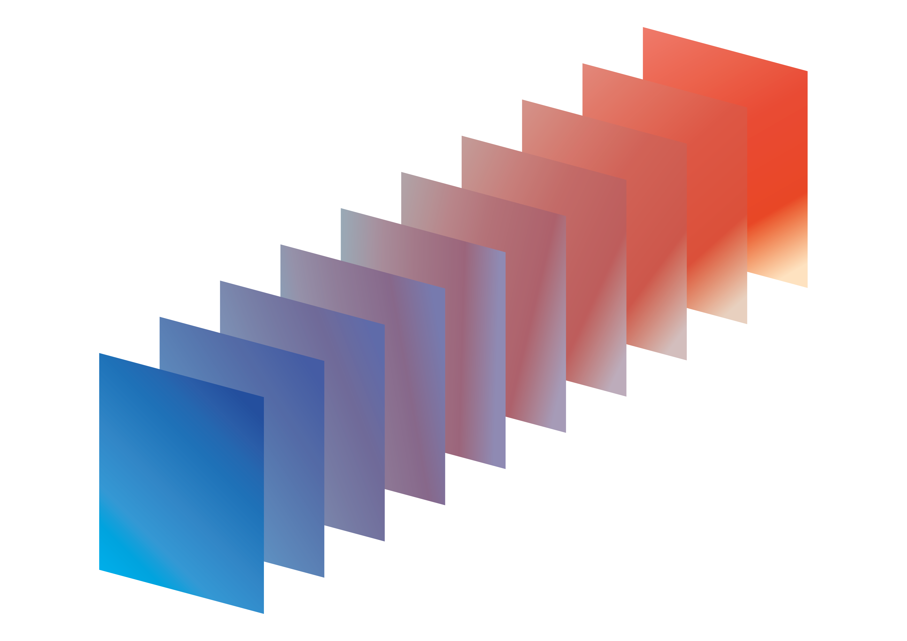

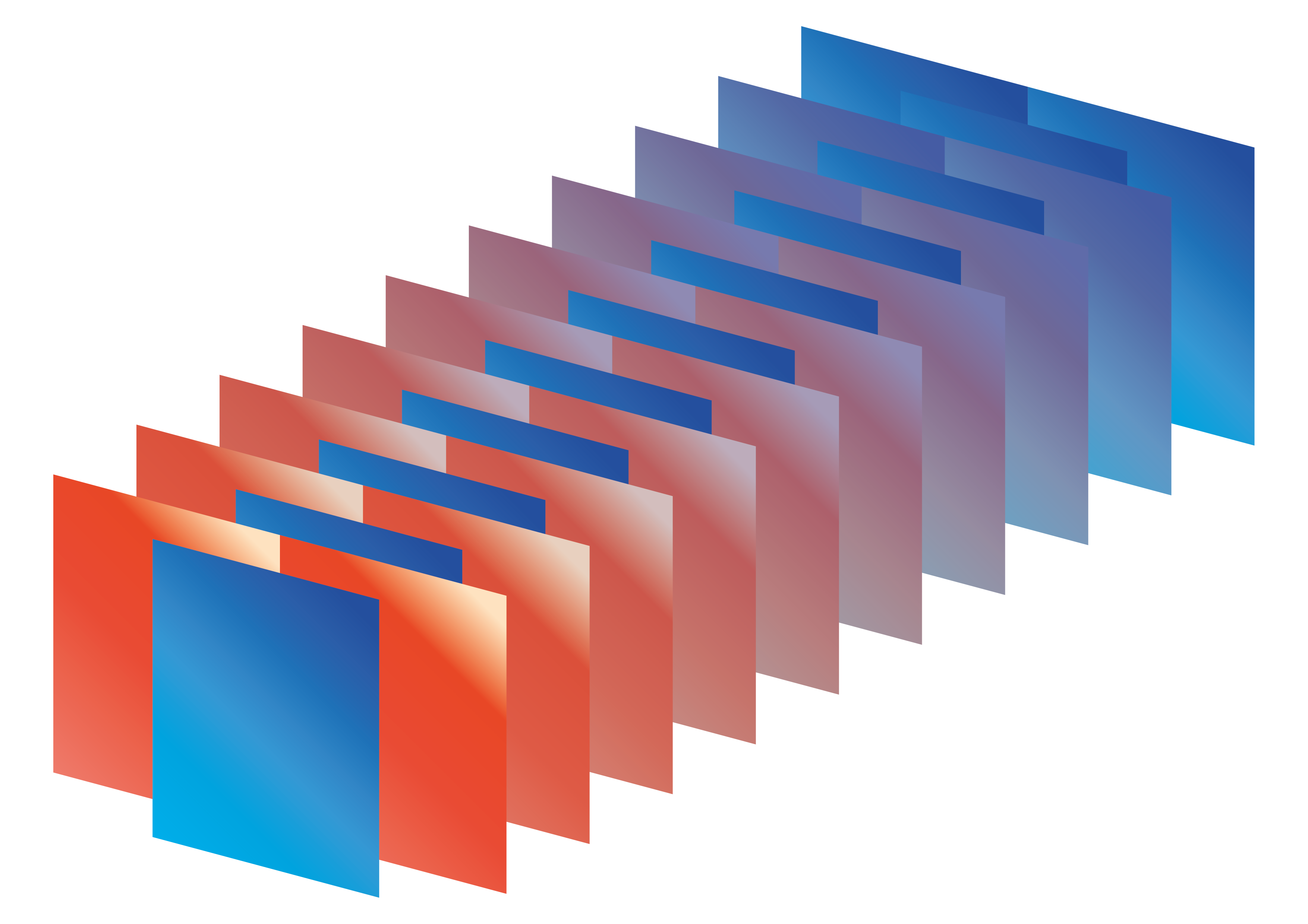
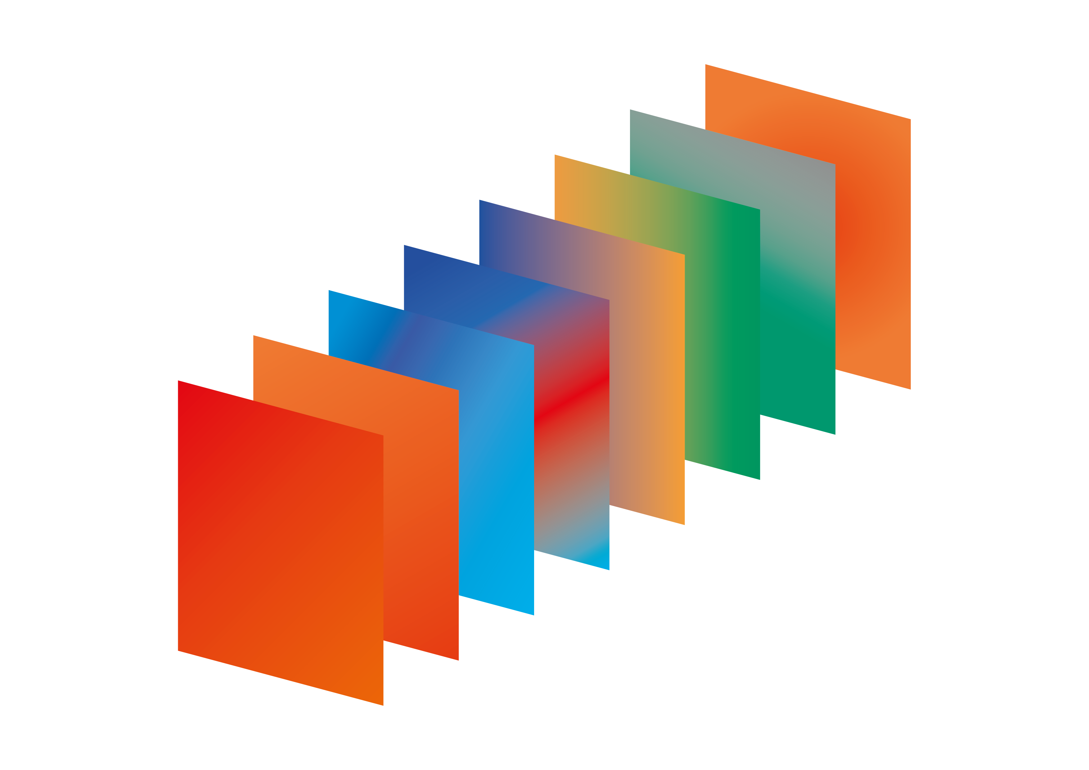
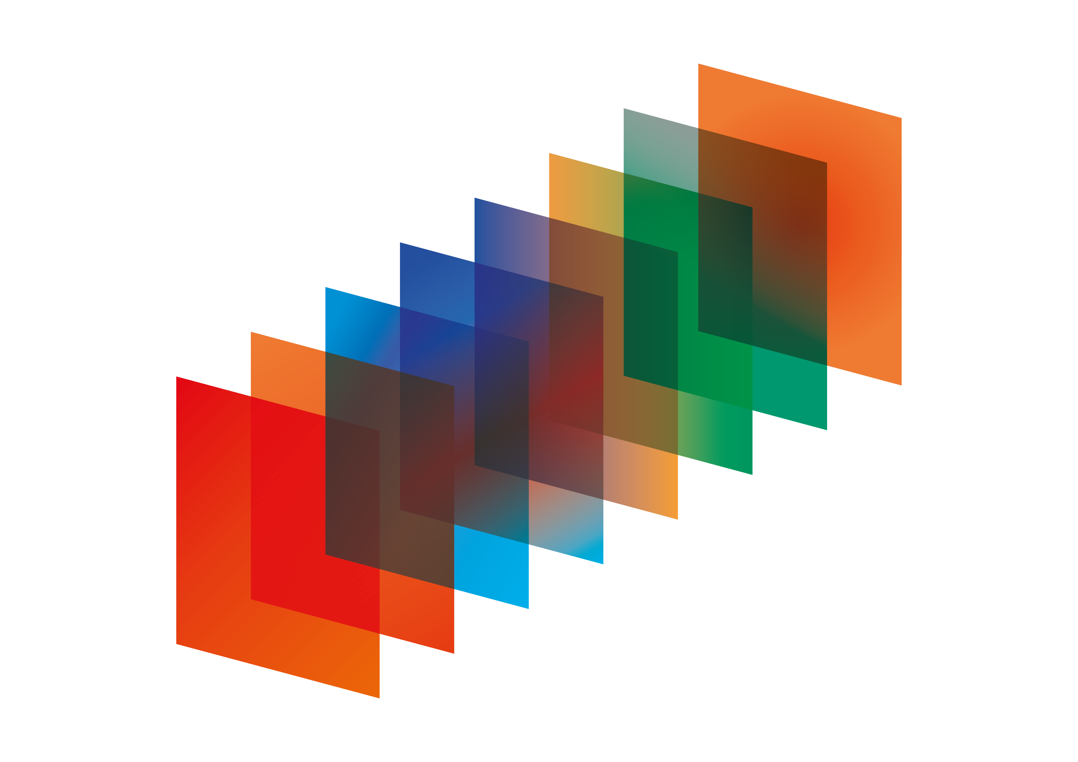
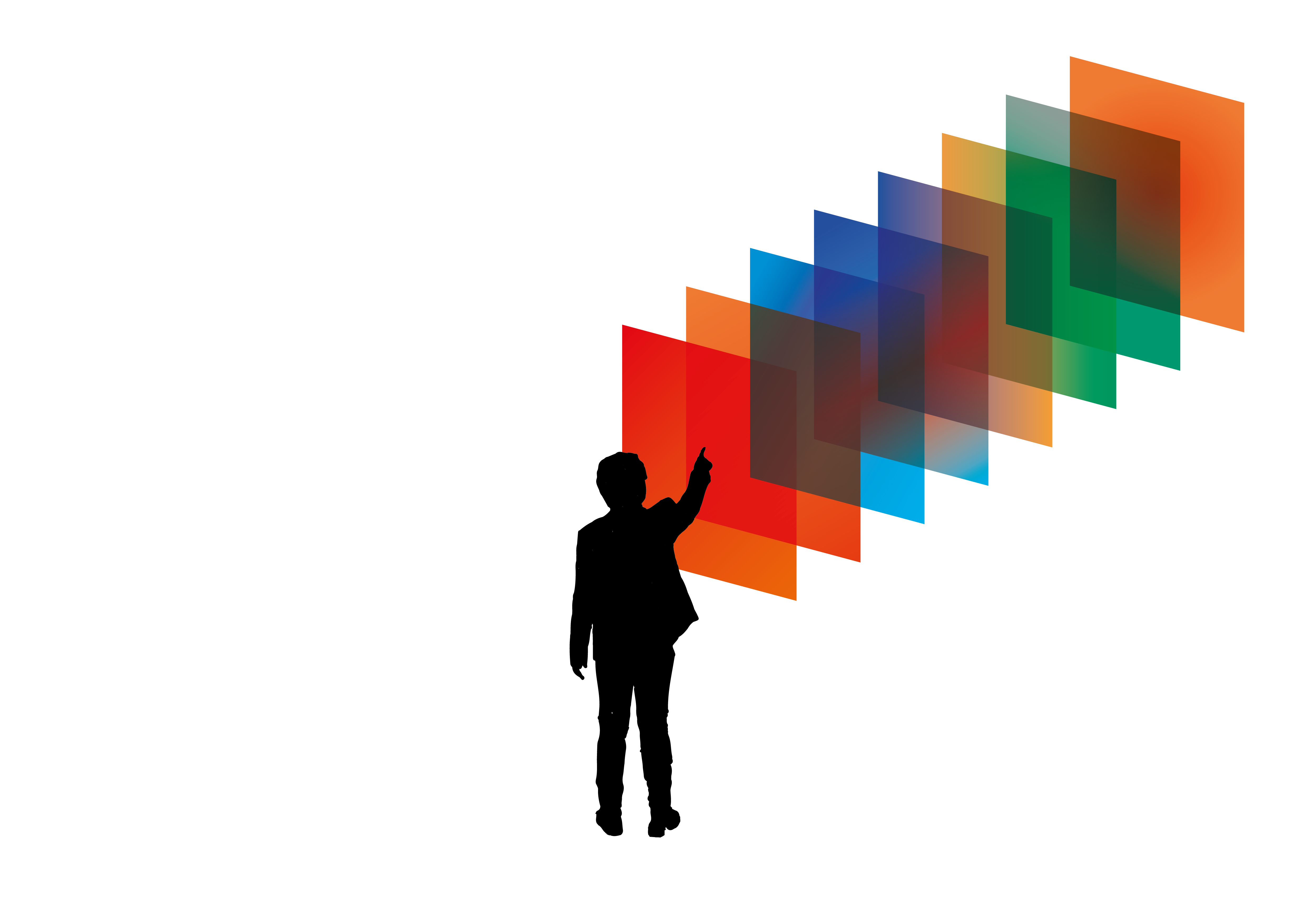
The colours above illustrate the journey refugees go through when escaping war, famine or other extenuating circumstances. The journey begins with orange a colour synonymous with the colour of the lifejackets used by refugees.
Following from this the orange fades to blue showing that the refugee has made their way to the ocean, followed by the streak of red highlighting the incredible danger and loss of life that is prevalent when undertaking this journey.
Finally the journey ends with the green setting of land and grey representing the entrance into the concrete jungle of the new city where the refugees seek haven and support. Only to be viewed as orange, a refugee who is not from this native land and is deemed a second class citizen.
Artefact of the Experience
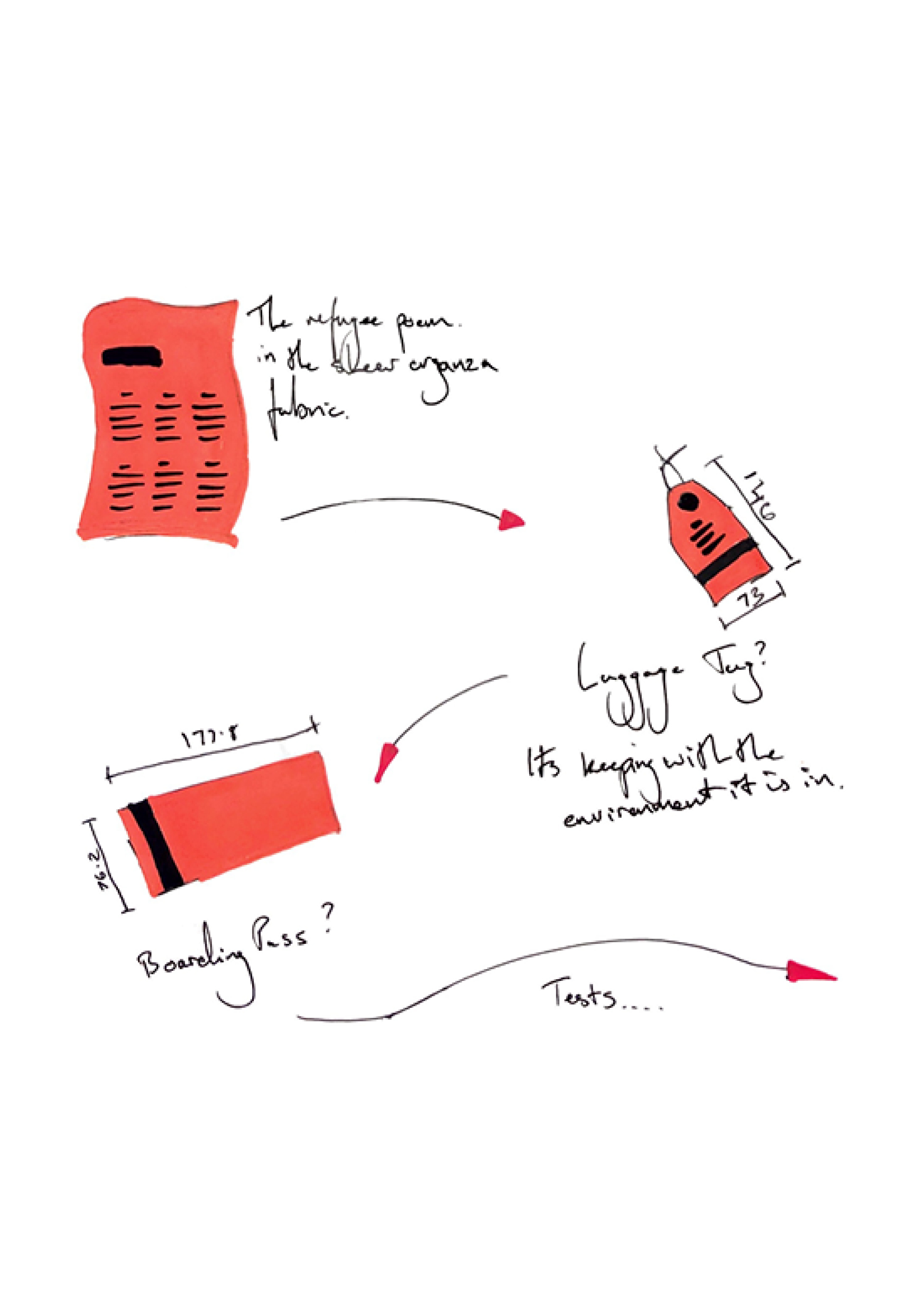
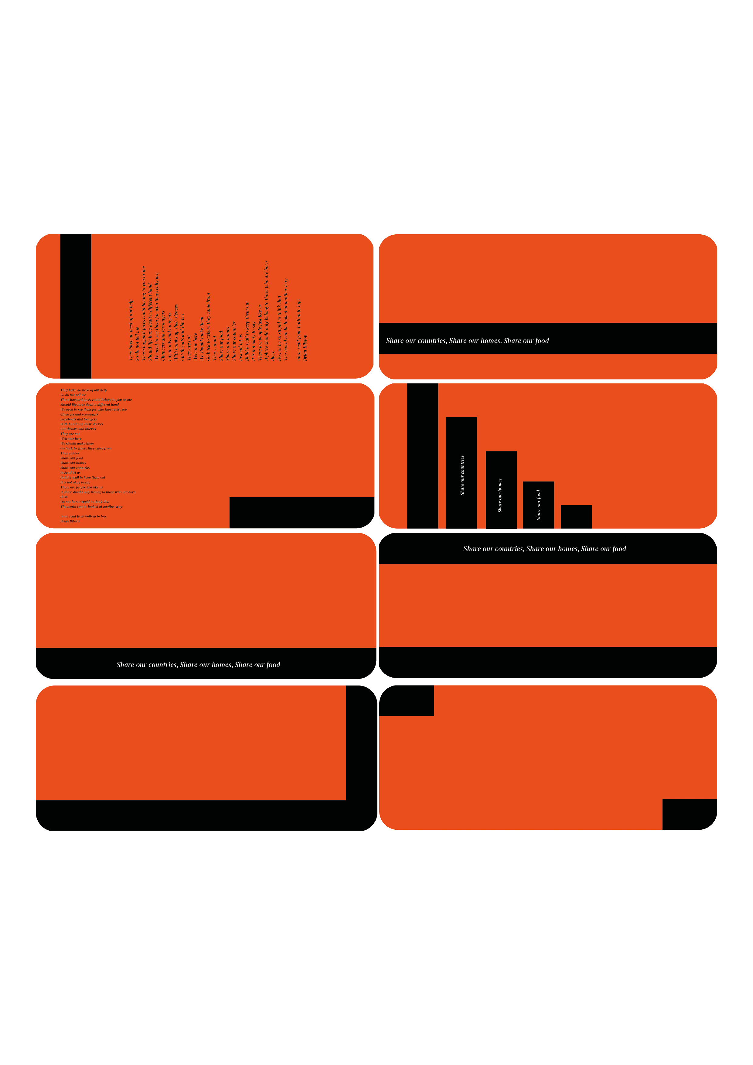
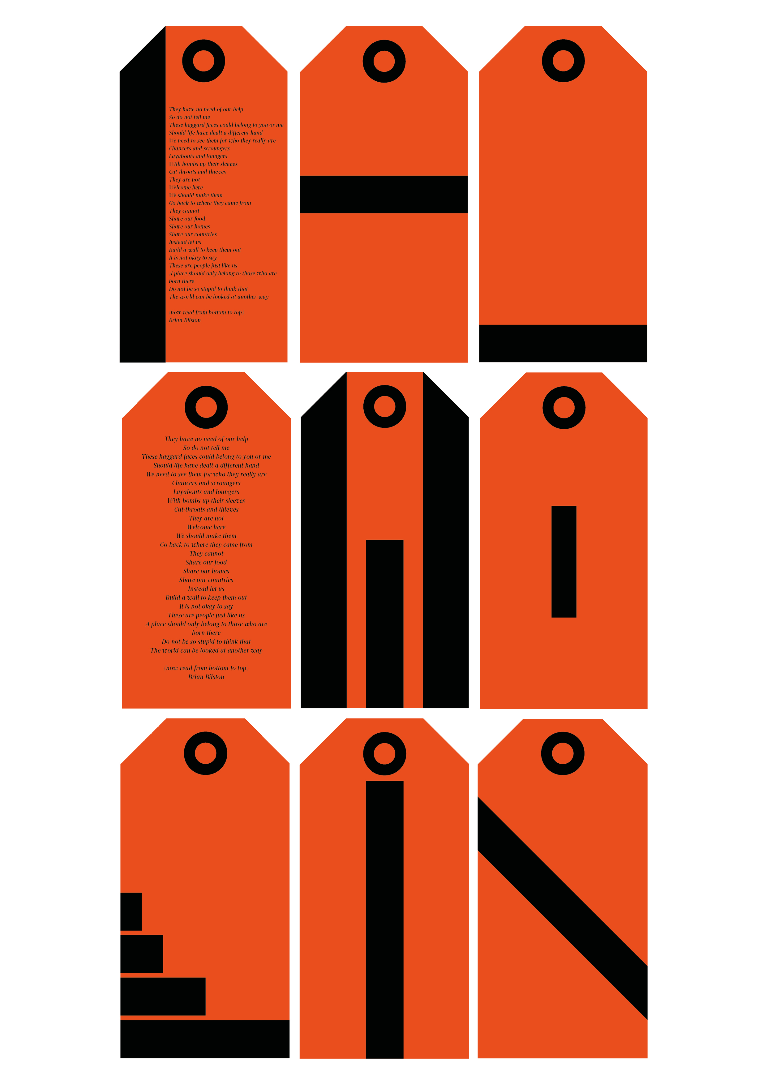
Looking back, this was the last piece of the puzzle as I wanted an object that was part of the exhibition but could be taken away by the user as a memento of the experience so that they wont forget about it and with it could start a social movement. And so the following shows the development of graphic styles in the form of a luggage tag and boarding pass as it would fit in with the surroundings of an airport.
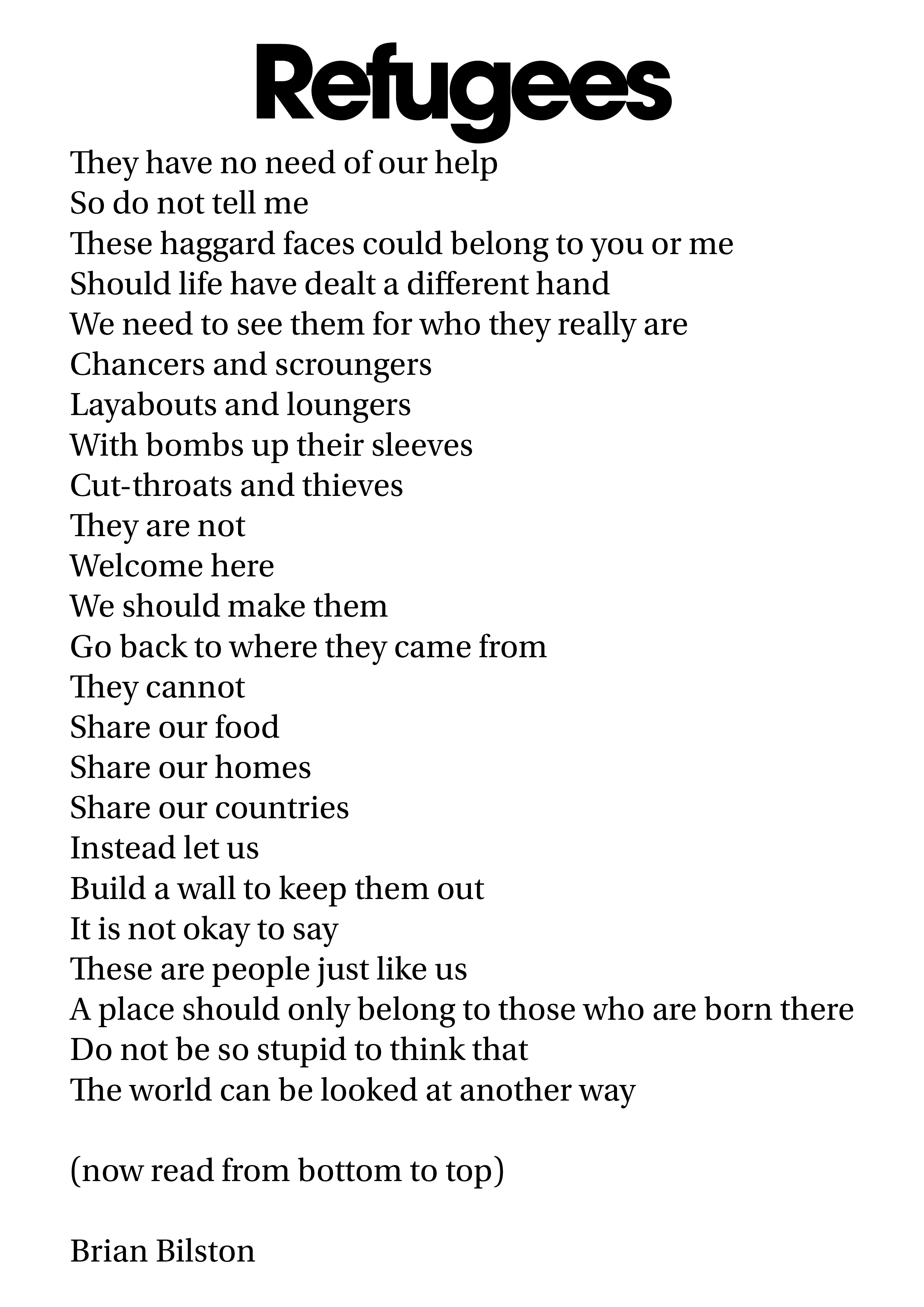
What I also wanted to include was Brian Bilston’s poem onto the artefact to again heighten the overall experience.
After several iterations of styles the artefact could take I found that I wasn't happy with any of the outcomes. It felt as though the tone of the intervention was not being conveyed well enough
Final Developments
With the colour developments, discussed earlier, added I also thought that having a dead end would be an appropriate element to have in this maze of journey to highlight the incredible danger and loos of life that happens when people cross entire oceans to seek freedom and safety. I also created orthographic drawings to show the size needed to create this experience.

Problem Solving
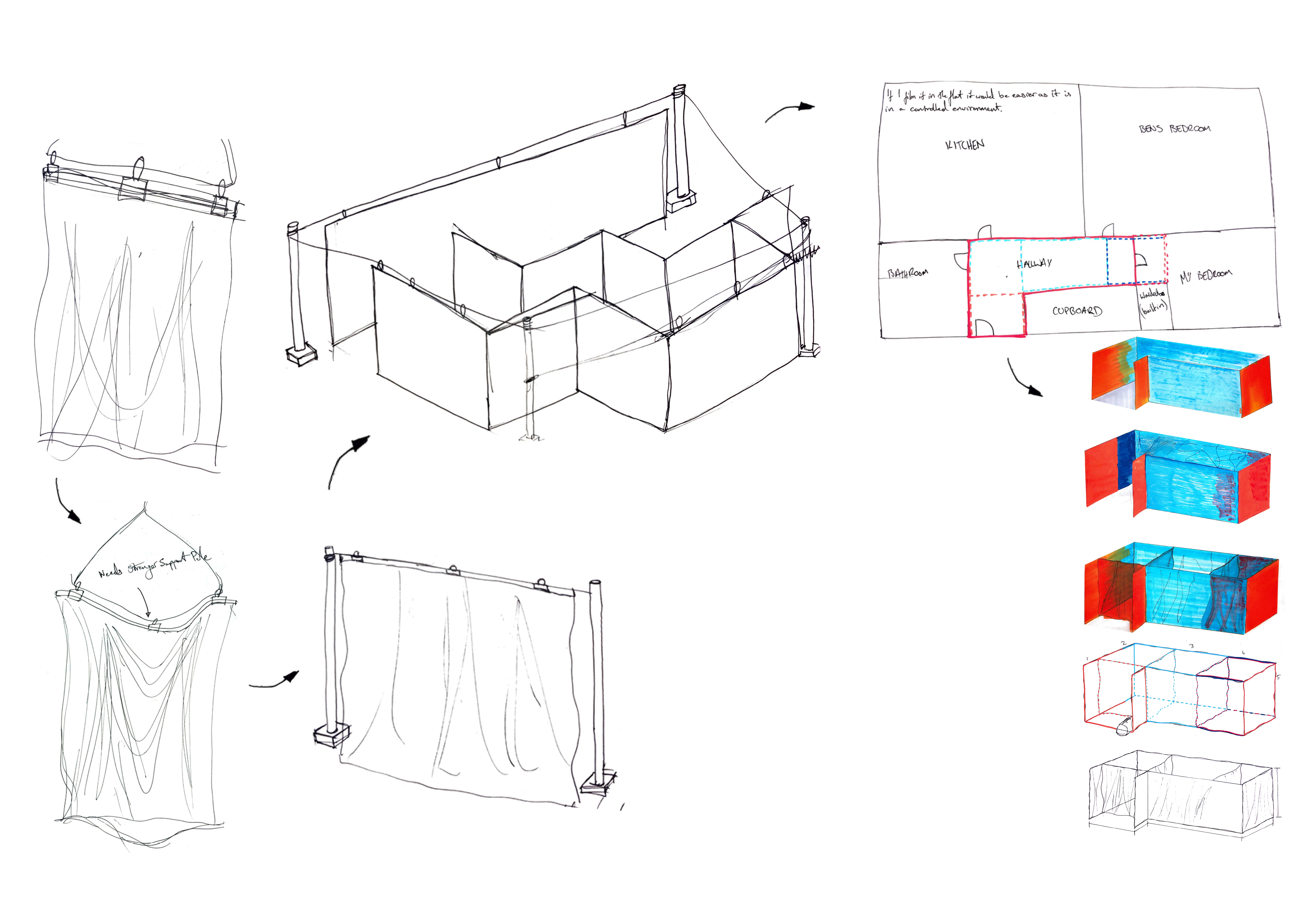

The main issue I faced when creating the exhibition was how I was going to hang the fabric to represent the semi permanent, moveable borders as they are a crucial part of this proposal. After sketching through and trying several variations as to how they could be hung I decided that I was best to change the shape of the exhibition to be less maze like as firstly it was becoming a more and more difficult to set up the fabric screens and secondly that I could not manage to find a large enough space to set up the exhibition. And so I modelled the shape of the exhibition on my hallway in my flat, this is where the exhibition will be filmed too for convenience sake. Luckily I had managed to set up the fabric screens against the walls using hooks and binder clips.
My regret is that the final shape of the exhibition has changed drastically from its intended form which led to some changes in experiences for the user. Had I planned to book/ find a space to set up the original shape this would not have happened, however I can hear Stuart Kerr’s advice in that I should be realistic and looking back on how I intended to set up the original shape with multiple poles and wires to hold up the screen was bound for failure I believe as it would have taken me way too long and severely lower the overall quality of the final outcome.
Final Delivery
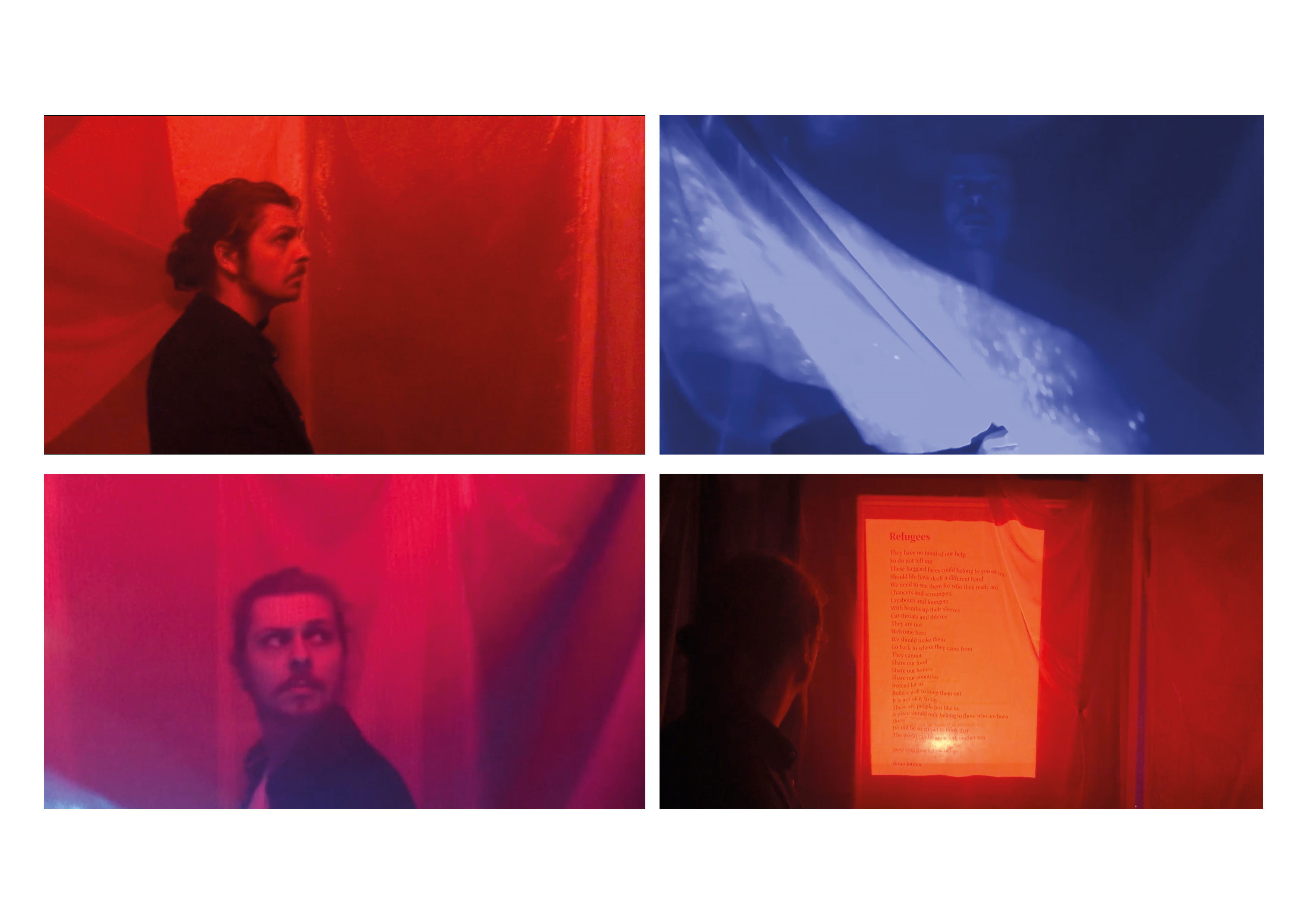
Above are screenshots from the final video which shows the exhibition and its experiences, It was filmed in the hallway of my flat using colour changing lights to help with crating the various moods for the exhibition, a projector to project water reflections and my flatmate to act as the user.
Overall I am happy with the result however had I had a extra help I feel the filming/ production would have been greatly improved therefore improving the overall quality of the film, better planning and time management would have avoided this situation and so I will remember this for future projects.
Nevertheless there are areas to improve and develop, these being that the user should maybe be challenged by both left and right wing views on immigration and the refugee crisis so that the individual can make up their own opinion, by doing this it would also relate to Brian Bilston double edged poem with its two perspectives.
Another improvement would be to look at the touch points again and find a way to naturally draw the users into this exhibition and finally the artefact should also be double sided, one side showing the poem in its multilingual state and on the other side the refugee flag to make more visually striking as well as allowing onlookers to see that the individual support refugees.
Another improvement would be to look at the touch points again and find a way to naturally draw the users into this exhibition and finally the artefact should also be double sided, one side showing the poem in its multilingual state and on the other side the refugee flag to make more visually striking as well as allowing onlookers to see that the individual support refugees.

Unfortunately I didn’t find the time to remake the video with the intended improvements however I did create a mock up visual model. Here is how I would show both the left and right wing views on the immigrant and refugee crisis by using projections.
Interviews, broadcasts and prime ministers question time would be shown in short bursts to show both sides of the argument which would then lead to the user making up their own mind about what they think on the matter. However this is as far as I have gotten but I will continue to develop and possibly resolve this project as I have grown quite fond of it and would like to see it through to a more resolved end.
Reflection
This was undoubtedly my favourite project from my third year at GSA. It allowed me to work in an area that greatly interests me and would like to pursue in the future. Furthermore I enjoyed the independence the project gave me as well as the tutors feedback and direction. It was nice to trust myself and my ability in this self-directed project.
However I will say that although I had a rough start in terms of researching, picking directions and concepts it did help me find and create methods in which to resolve those issues which I think is more beneficial than having an easy time with the project.
Unfortunately as I have already previously mentioned I would of liked to made more concrete improvements to the final outcome in terms of re-shooting and adding finishing touches to the video and work on improving the touch points in which the user can discover and interact with the museum.
This project allowed me to meet and contact many inspiring designers which in turn gave me some brilliant insight for what they had learned when they were design students to here they are now and so while may not be fully resolved, I can say that my confidence and my ability has progressed since the beginning of this project.
If you would like to know more about this project.
Drop me an email, lets talk.
--->
c.sferguson25@gmail.com